Launched back in August 2013, the Fox's Caffè range is a relatively recent addition to a biscuit aisle still dominated by age old brands. Pitched as made-for-coffee biscuits, this proposition did get my attention at the time purely for the fact that I didn't exactly know what made a biscuit specially suited to a cup of coffee. Therefore, when I saw this product from the range, together with its caramel variant, so prominently displayed in packaging that diverges markedly from other Fox's offerings, I thought it time to give it a go for the blog.
THOUGHTS
Packaging:
- Primary panels:
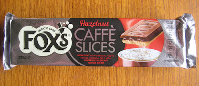
In terms of the colours used, black and grey combine to give the product an air of sophistication and luxury. The presence of red injects the design with warmth and significantly amplifies the sense of indulgence felt in the product shot to the right of the panel. Basic colour principles continue to be employed well with a central black graphic accentuating the redness of the key product text, in particular, the smart 'Hazelnut' cursive text. Moreover, the creamy white of the Fox's graphic contrasts well with the other components setting it off nicely. Indeed, the three overlapping components of the Fox's graphic on the left through to the product shot on the right are visually delineated by shape and/or colour whilst sharing enough tonally to sit as a cohesive whole.
As for the front panel, here the basic nutritional information was displayed in a manner that continued to be very clean in its lines. The only thing I will say against this area of the packaging is the positioning - I would have rather seen such content buried on the opposite panel as it does slightly detract from the main presentation angle.
- Secondary panels:
In following on from my last thought, the content pictured here on the back panel would have been ideal for the front. Its quick description of the biscuit and condensed 'Caffè Slices' graphic would have been coherent with the top panel's presentation and added that extra bit of visual impact. That said, I'm not sure why the brand chose to invert the content as it simply makes it awkward to read.
More basic product information was given on the bottom. Admittedly, this was a no-thrills presentation but one that retained a sense of maturity about the design and, subtly, made a visual link back to the main product logo with the small top-hat graphic on the far left.
Looking underneath the flap a lovely bit of content was exposed. Serif-style text on the left provided a bit of historical background to the Fox's brand. Whilst, next to this, a more relaxed, sans-serif style of text quickly explained the Caffè range. This was a great touch for me that helped place the range amongst the larger brand narrative.
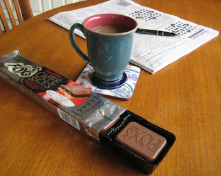
Opening up the pack the biscuits came in a pull-out black plastic tray that was partitioned to hold three lots of two stacked biscuits. Simple and effective with my only gripe being that, just like the back panel, everything seemed inverted with the biscuit's smart Fox's branding pointing away from me.
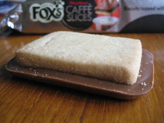
With respect to the individual biscuits, these were pretty substantial offerings. Each biscuit weighed in at roughly 23 grams (over twice the weight of the Maryland Cookies I reviewed the other day) and measured 60mm in length, 46mm in width and a decent 11mm in depth. Presentation-wise, the Fox's branding on the top was very clean and smart, there were no blemishes in the chocolate finish and the shortcake had the look of a very even bake.
Taking a bite, the hazelnut centre with its more savoury notes did come through and was a welcome contrast to the powerful wave of sweet milky chocolate that hit the palette. The shortcake biscuit had a very nice buttery taste to it but that was lost in the strong flavours of the toppings. That said, it did provide a strong textural point of interest amidst the softness of the other components.
SUMMING UP
I felt the packaging had good shelf standout with a maturity about it that differentiated it from surrounding brands. Indeed, the principal panel design felt well thought out. Basic colour principles were effectively employed to place emphasis where need be and the stylisation of the text and graphics all worked in concert to reinforce the range's more sophisticated positioning. The biscuits themselves were relatively substantial offerings and with their clean look and Fox's branding they looked impressive. Taste-wise, sweet milky chocolate dominated the palette but the savoury notes of the nut filling did get a good look in and the shortcake provided strong textural contrast. Personally, I would have toned down the sweetness in the chocolate, but, with the bitter notes of a strong coffee to balance things out a bit, I can see many people really enjoying these 'biscwits' - as Fox's Vinnie the panda come Mafioso would say.
Anyway, I'll give the last word on the Caffè range to Vinnie himself...
BRAND LINKS


No comments:
Post a Comment