In another very quick look at some festive packaging doing the rounds, I spotted these lovely traditional designs from iconic brand Colman's. Featuring snow-covered scenery, the mint and seafood sauce artwork directly picks up on the key ingredient whilst the horseradish is a little more subtle. Personally, I'm particularly fond of the mint sauce with its robin but these are all really nice and a welcome sight.
Here's a closer look at these limited edition designs:
Admittedly, my knowledge of fashion is such that the packaging's reference to a 'Matthew Williamson' was entirely meaningless to me - then again I'm not the supposed 35-54 year old female target market. Googling, I found out that the man was a notable British fashion designer and the wrapper design was an update on his signature 'butterfly' print. Personally, I loved these snazzy redesigns. They remained loyal to the general Aero look whilst delivering boat loads of interest to reinvigorate shelf standout. Indeed, I can see these playing to an even broader age range than that suggested.
A definite thumbs up to Nestle on this one. Here are the designs in full:
With
Christmas adverts doing the rounds and lots on tempting goodies on shelves,
we're fast approaching merry December. Not wanting to miss out on the action,
Kellogg's have rolled out some limited edition Christmas packaging for four of
its classic offerings. The children's cereals, Frosties, Coco Pops and Rice
Krispies, are all bright and fun with their respective mascots donning Santa
hats in front of Christmas tree-decorated backgrounds.
That said, most interesting of all is the more traditional packaging for Corn Flakes given that it completely breaks with the cereal's usual look. A lovely, traditional-looking depiction of Santa by Norman Rockwell features front and centre against a snowy white background. In a couple of other touches, one of the side panels includes the full words to 'Twas the Night Before Christmas' and the bottom panel sports a nicely condensed version of the primary graphic. Indeed, the packaging is eye catching, hits the right tone for this most iconic of cereals and links in well with the brand's classic Santa Claus advert - soon to appear on screens I'm sure. Anyway, having picked up a box, here's all the pictures of the design:
Angel Delight: A recent study has found Angel Delight to be the nation's most beloved childhood dish with consumers commenting that it evoked strong memories of birthdays and summertime. Personally, on just the desserts and puddings front, I would have gone with something like a traditional homemade crumble or steamed pudding having grown up with my family's wonderful Sunday Dinners. Then again, everyone to their own.
Galaxy: Mars has added two new permanent additions to its Galaxy range under the name, 'Duet Bars'. The bars will feature two flavours - 'Cookies and Cream' and 'Caramel and Shortcake' - which will separately flavour the chocolate allowing consumer to choose whether they eat just one flavour at a time or both simultaneously. Retailing at 60p each, expect to see these bars in stores come August.
Marmite: It's summer so Marmite have decided to release a limited edition spread made with lager yeast. Apparently, this special yeast will make the spread a light, summery one. The product will come in two jars, ‘Summer of Love’ and ‘Summer of Hate’, which will sport illustrations inspired by the 60's. Moreover, only 94 'Summer of Hate' jars will be released nationally making them a fun collectors item. The jars are expected to retail at £3.49.
Roses: Cadbury has redesigned its iconic Roses carton, first released in 1938. A concave top has been applied to the carton's body to carve out a more distinctive look on store shelves. The new packaging will also be brought in for Cadbury Heroes and Terry’s Chocolate Orange Segsations.
To tie in with the soon to be released Minion film, Honey Monster Puffs is releasing a limited edition version of the cereal. The product will include Minion graphics on pack (as above) and the cereal will feature banana-flavoured 'crispies'.
From just the product images circulating online, my first impression of the design is very good. I think the front panel artwork with the Minions popping out on the right hand side of the design captures the quirky, fun element of the characters. Moreover, the prominent blue and yellow of the basic design keys in extremely well with the Minion look. Also, I have to say I was amused by the notion of these yellow creatures getting behind a Monster-based cereal - very Minion-esque indeed. As for the other panels, I am pleased to see that some thought has been put in to the side panels with one providing a relatively large piece of Minions content. Finally, the back panel sports a very large Minion cut-out allowing for some good old on-the-box fun.
All in all, this looks promising. If I spot a box when it hits the shelves I'll be sure to give it a GBD write up.
If you are after more things Honey Monster related, please see my original website reviews of the brand's products...
Just a quick bit of news on a current promotion Kit Kat is running. As part of the brand icon's new 'Celebrate the Breakers Break' campaign, the product has broken with its traditional wrapper design to amuse shoppers with different types of 'break'. Here's just some of the breaks that came in my multipack...
As with Jaffa Cakes the other day, I've just revised my Dairy Milk entry on the GBD website so you can now see the brand's evolution. I've found it really interesting going through all the decades so I hope you do to.
Browsing the biscuit aisle in a local supermarket with the blog in mind my eyes drifted to an area so positioned as to almost demand that it be overlooked. In this land of biscuit obscurity I spotted a brand pushed right back on the shelf that I hadn't eaten let alone seen for a very long time, Fox's Sports biscuits. Getting them home and quickly researching, the only information I could glean about these little shortcake beauties was that they were invented by a chap called David Glen in 1971. Indeed, with very little background and no advertising to memory these biscuits have seemingly been left to march on all by themselves and, to that end, I thought it was about time they got some attention.
THOUGHTS
Packaging:
Employing a red background with a large streak of light blue across it and accents of white, the basic look had a fluid, energetic feel about it that keyed in to the type of designs we've become accustomed to seeing in sports products. Building on this, the product shot was centralised to draw in the eye to the sporting depictions. This imagery worked well with the background: a streak of white lined up with the batsman to signify a ball's trajectory, and a cyclist's wheel connected with an area of red as if it was a road surface. This little interplay between the background and the product shot created a bit depth and added to the overall dynamism of the presentation. As for the 'Sports' brand name, italicisation supported the energetic feel whilst the 'stocky' font spoke of a certain solidness and dependability.
The sides condensed the primary elements of the design to reinforce the sports positioning and create an appealing display angle. The little 'quality guarantee' graphic featuring the brand's panda mascot, Vinnie, was a nice touch as it brought a bit of added interest and personality to an area which is usually more of copy and paste job.
The underside offered the usual, no-thrills design. That said, clean lines and use of the same colour scheme brought clarity to the content and reinforced the athletic, sporting connotations of the presentation as a whole.
Biscuits:
The biscuits were pretty large but weighed in at a relatively light 8g each. On the looks front, I loved their quaint little border design and embossed sporting depictions. Obviously, the depictions weren't of the quality shown on the packaging; however, they were sufficient to imbue each biscuit with a bit of its own sporting personality. As for their taste, the biscuits gave off a lovely sweet aroma that translated to the palette in a well balanced fashion with the salt and fats included.
SUMMING UP
The packaging did well in bringing together colour scheme, graphics and font to reinforce the key sports theme. Moreover, the interplay between the product shot and background was a nice touch that brought a little bit of depth and added dynamism to the design. The biscuits themselves proved the highlight with their embossed depictions of various sports. Whilst these depictions were not of the quality on the packaging, they effectively imbued each biscuit with a bit of its own personality. Taste-wise, the flavour balanced out the sweetness in the flour mix well with salt and fat to create a lovely, well rounded offering. Indeed, it may be a simple proposition but it did the simple things well and with charm - something that will always be a winning combination in my books.
In what I feel will be a continuous project of revising old articles and integrating blog content, I've just updated the website with a McVitie's Jaffa Cakes resource.
With new products seemingly coming thick and fast from the big chocolate brands at the moment, I wasn't surprised to find this offering from Nestlé's Aero pop up on shelves. Admittedly, like the Toffee Crisp from yesterday, I was intrigued as I couldn't really remember the last limited edition/new product from Aero, plus I didn't know how much this 'mousse' layer would really add.
THOUGHTS
Packaging:
Like the Galaxy Salted Caramel in yesterday's post, this bar's design borrowed very heavily from the core offering in its general colour scheme and stylisation of the brand name. One addition though was, obviously, the 'mousse' text which nicely employed a fluid look and 'wispy' lines of varying stroke width to convey a notion of lightness and elegance that was very in line with the bars intention of targeting women. The product shot on the right kind of showed the mousse layer if you looked closely but, to be honest, to an eye scanning the shelves this would look like a picture of a regular piece of Aero. Lastly, a gold coloured 'new' graphic appeared in the top left though, by virtue of its positioning, I found the creases in the wrapper obscured the text. Indeed, the design looked nice enough and, in terms of brand design coherency, it was on the money. However, unlike Nestlé's Toffee Crisp Honeycomb design, it could be argued that it didn't do enough to differentiate itself on the shelf and, thus, give it sufficient personality in of its own right.
The reverse provided the basic product information with light and dark colour used effectively against the gold backdrop to bring some clarity to the design. Moreover, the 'cocoa plan' graphic under the flap sat very nicely with the overall Aero colour scheme and, by virtue of its crisp text, reinforced a certain sense of smartness and sophistication about the bar.
Bar:
Even more so than the wrapper, the bar itself remained on-brand in adopting the Aero's bubble-like segments inscribed with the brand name.
Taste:
Taking a bite, the bar's aeration delivered that classic Aero textural experience of chocolate almost crumbling away in the mouth. Trying to be very aware of the textures, I do think that there was a bit more of a contrast in textures with the addition of the mousse layer but it wasn't overly apparent. That said, I found the taste incredibly smooth and light. Indeed, I felt at the very end that the bar had more perfumed my senses with the flavour of cocoa than weighed me down with it. All in all, I don't think people will think this too different to the original bar, but I did find it pleasant enough to eat and I may well consider it again if I want a light hit of milk chocolate.
SUMMING UP
Looks-wise, both the packaging and the bar were very on-brand with a lot of very strong design nods to the core offering. Indeed, as with all Aero products, it pitched itself to a female market well with its smart, elegant appearance that reinforced the lightness of the chocolate. Admittedly, I think it was so on-brand that it lacked a bit of its own personality and, certainly, didn't stand out on the shelf as well as it probably should have. Taste-wise, this bar offered beautifully smooth and light milk chocolate; however, I feel the difference between it and the core offering would, perhaps, be a little too subtle for some.
I like to chewit, chewit...I like to...CHEWIT! The line that invariably plays in my mind like a broken record whenever this icon of the sweet aisle pops up on my GBD radar. Indeed, with Chewits turning the big 50 this year and lots of brand activity surrounding the sweet's anniversary I'm sure this line will, justly, be given lots of airing along with the good old 'Muncher' - the answer to what Godzilla would be like if he had a sweet tooth. So, without further ado, lets kick off this nostalgia fest come whirlwind journey through Chewits' history with the ads.
50 Years of Chewits Advertising
To begin, the brand's very first advert from 1976 - an absolutely fabulous claymation piece that introduced the world to the Muncher...
Carrying on from the 70's, in what was, for me at least, the golden period of the brand's advertising, is a great 80's advert humorously playing on old war advertising...
In the 90's Muncher took on a slightly different, more colourful look with, firstly, a humorous ad that plays on the exaggerated tone of post-war advertising...
Then Chewits begun experimenting with puppet versions of the Muncher...
The 90's saw the eventual demise of the claymation or puppet-based Muncher with the introduction of a 2D animated character called Chewie the Chewitsaurus. Admittedly, as a practical effects aficionado, this was a real pity to me but, nevertheless, the tone was kept fun, colourful and upbeat, plus we gained a very catchy jingle...
In this 00's ad we see Chewie look looking rounder and, gerenally, more friendly in appearance...
Finally, in what I presume was the effect of new legislation coming in limiting brands' ability to advertise to children, Chewie/Muncher disappeared from our TV screens. That said, the mascot was redesigned in 2009 to give it a younger, slicker look. This new look character appeared in a variety of brand materials, including an animated Christmas card, which the following is a screenshot from:
50 Years of Chewits Packaging
Starting off in the 70's again, the packs keep things very simple. The background sports a decidedly groovy looking design with waves of colour to signify the different varieties of flavour. As for brand name, it is occupies a straight-forward central positioning with rounded, informal font that employs white and a bit of drop show to stand out as prominently as possible from the background.
Moving on to the 80's and the brand occupies a more asymmetrical, off-centre positioning so the design can accommodate the inclusion of relevant fruit-themed graphics.
As for the 90's, the packaging on the left carries on the look adopted in the 80's. However, the packaging underwent a distinct evolution as the decade progressed and Chewie the Chewitsaurus arrived on the scene. Indeed, in line with the added vibrancy and animation of the new mascot, the pack design stepped up the fun factor. The brand name moved back to a more central positioning but, for the first time, the characters carved out a rather irregular line generating a sense of movement. Also for the first time the mascot featured on the pack with a graphic showing Chewie's yellow and green striped body stretched right across the design. All in all, the pack lost its 70's waves of background colour but it gained a healthy injection of fun and personality with Chewie's introduction.
Moving through to the end of the 00's Chewie was markedly redesigned and, in line with this, the pack went through another distinct change. The characters in the brand name reverted to the straight line of old whilst the 'Chewits' text went over to the right end of the pack. As for Chewie and the fruit graphics they combined in an image on the left showing mascot splattering fruit juice everywhere. Moreover, above this Chewie graphic, which spanned two sides, the brand's website address stretched the length of the design. Indeed, this may not have been quite as colourful as its predecessors but Chewie's graphic did sustain a level of fun and energy in the design.
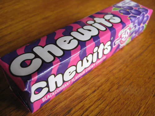
Finally, to today's limited edition Chewits packaging celebrating the brand's anniversary. The following design for their blackcurrant variant omitted Chewie from the pack's exterior and harked right back to the brand's earliest designs with the re-introduction of those waves of colour. Like some of the 80's and early 90's designs, the Chewits brand name was off to left and the fruit graphic was back on the right end of the pack. As for the sweets themselves, the nods to designs of old were brought full circle with the modern Chewie featured in a fun little wrapper graphic.
Oh and, as for the taste, Chewits remain as good as ever. The chews are nice and juicy - not too hard or soft - with a pleasant undercurrent of blackcurrant that isn't overpowered by sweetness. Simple, effective stuff very well done.
SUMMING UP
Chewits has gone on from its humble beginnings in Southport in the mid 60's to become a true brand icon of the Great British Diet. Stellar advertising has left many Brits with fond memories of both the Muncher and Chewie the Chewitsaurus rampaging through the streets to tunes that span all the way from wartime to the modern day. Moreover, the sweets themselves, whilst naturally evolving in design, have manged to retain the vibrancy, colour and fun that characterised the brand from its very beginning. All in all, a fun, great tasting chew that is full of nostalgia and has us keep coming back for more. Indeed, I have no doubt many a Brit will be carrying their 'regulation Chewits' for a long time to come.
Established in 2009, Dorset Tea can be said to be a relatively recent addition to the Great British tea scene, especially when considering the heritage of the big brands it shares shelf space with. That said, the minds behind its success are very much seasoned when it comes to all things tea. Its founder, Keith Spicer, established his first tea company, Spicers, in 1934 aged only 24 whilst its master blenders, Tony Warr and Jimmy Medhora, boast an impressive 57 years of experience. All this wisdom has gone in to creating a wide range of teas spanning good old breakfast blends to green tea to fruit infusions. However, I'm going to begin with their signature product, 'Golden Blend', an everyday tea which not only enjoys fervent support from a number of Brits but, in testament to its quality, has also managed to retain its Great Taste Award since 2010.
THOUGHTS
Shelf standout: By virtue of the packaging's rectangular shape, the product is differentiated on the shelf given competing brands' adoption of taller, slimmer designs. Moreover, the light, summery tone of the product's imagery does well in cutting through the other packaging in the everyday tea category with their plainer, bold statements of colour. Indeed, every time I see this packaging I feel drawn in by the artwork with its romanticised vision of the English coastline.
Packaging Analysis:
- Top panel:
With the green hills and flowers in the foreground looking out to the sea's horizon where the sun radiates out from a degree of depth is created that compels the eye to immerse itself in the design. The artwork's light, fresh colours, particularly the golden hue used throughout the design, work well in conveying the product's message of naturalness and vitality. Indeed, the way in which the brand name overlaps the sun graphic helps visually underscore this link with vitality. Moreover, in wanting to capitalise on those romanticised by the imagery, the 'Live Breathe Drink' message makes explicit the connection between consuming Golden Blend and the world that is depicted. Finally, concealed tear lines in this primary panel allows the presentation to go relatively unspoiled.
- Front Panel:
Here the design from the top panel is condensed nicely so when the box is sitting flat a highly decorative and visually arresting presentation hits the eye. To open, perforations line the panel to allow for a clean tear. Moreover, to close, the lid can be simply slipped in behind the front where it will sit very snugly. Simple yet effective stuff.
- Side panels:
Plenty of effort continues to be put in to the side panels with a fun design that very much employs the same colour scheme as before to carry on the feelings of freshness and vitality. In addition, in both panels the writing and graphics feel relaxed and hand done in their stylisation making for a more personable, crafted feel.
- Back panel:
After the other panels this one may feel a bit sparse but it stops the design becoming overly busy and puts all the focus on the brand whilst maintaining the light, fresh feel.
- Bottom panel:
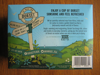
Sharing the qualities of previous panels, this one is just as engaging with a playful signpost in the foreground adding emphasis to the scenic surroundings of the depicted 'Dorset Tea' world. Of course, some text is thrown in and this is kept relatively light with a discussion of the blend and the key selling points.
Taste:
Coming in a traditional square shaped bag a generous amount of tea is given per serving that looks easily enough to give decent flavour in a large mug. To taste, the tea is indeed a well-rounded one with some malty, slightly earthy depth to it. These punchier, mature notes - a result of the Assam flexing its muscles I suspect - sat very well with me and gave the drink a distinctive character that I would happily pay for again.
SUMMING UP
The packaging has great shelf standout with imagery that draws the eye in to its romanticised vision of the English coastline. Indeed, it is obvious that a great deal of thought and effort has been put into every inch of the packaging so it can sit as a coherent whole in reinforcing the brand's core message. The tea itself is a well-rounded everyday offering with a slightly malty, earthy character that adds a depth and maturity to its taste profile. All in all, this is a strong offering from Dorset Tea that impressed me on multiple levels.