Wednesday 24 June 2015

NEWS: Angel Delight, Galaxy, Marmite and Roses

Angel Delight: A recent study has found Angel Delight to be the nation's most beloved childhood dish with consumers commenting that it evoked strong memories of birthdays and summertime. Personally, on just the desserts and puddings front, I would have gone with something like a traditional homemade crumble or steamed pudding having grown up with my family's wonderful Sunday Dinners. Then again, everyone to their own.


Galaxy: Mars has added two new permanent additions to its Galaxy range under the name, 'Duet Bars'. The bars will feature two flavours - 'Cookies and Cream' and 'Caramel and Shortcake' - which will separately flavour the chocolate allowing consumer to choose whether they eat just one flavour at a time or both simultaneously. Retailing at 60p each, expect to see these bars in stores come August.

For a look at the product and to read more: http://www.fdin.org.uk/2015/06/mars-launches-new-galaxy-duet-bars/

Marmite: It's summer so Marmite have decided to release a limited edition spread made with lager yeast. Apparently, this special yeast will make the spread a light, summery one. The product will come in two jars, ‘Summer of Love’ and ‘Summer of Hate’, which will sport illustrations inspired by the 60's. Moreover, only 94 'Summer of Hate' jars will be released nationally making them a fun collectors item. The jars are expected to retail at £3.49.


Roses: Cadbury has redesigned its iconic Roses carton, first released in 1938. A concave top has been applied to the carton's body to carve out a more distinctive look on store shelves. The new packaging will also be brought in for Cadbury Heroes and Terry’s Chocolate Orange Segsations.

NOSTALGIA HIT: 70's/80's John Smith's Yorkshire Bitter

These 70's and 80's John Smith's ads set in Yorkshire parody famous British comedy, Last of the Summer Wine, to give us a good laugh. The first one with the dog is a particular highlight for me whilst the last one is poignant in a way only a beer advert could be.


Tuesday 23 June 2015

NOSTALGIA HIT: 80's Country Life Buttermen

An ad now from the early 80's featuring the Buttermen, Country Life Butter's jolly group of butter-based mascots. Starring in a string of ads throughout the decade, the Buttermen were full of charm and had a great tune that very effectively got the brand's slogan, "You'll never put a better bit of butter on your knife", dancing around people's head. 

Sunday 21 June 2015

Friday 19 June 2015

NOSTALGIA HIT: 80's Jacob's Trio

Here's a quick 80's blast of nostalgia featuring the sadly discontinued Trio bar from brand icon Jacob's. 


NEWS: Weetabix and Cadbury launch new products

Weetabix Protein Crunch 
Weetabix is launching two new cereals under the 'Protein Crunch' brand name to target consumers wanting more protein in their foods. This move comes after the cereal manufacturer kicked off a new advertising campaign, entitled 'Weetabix. Incredible Inside'. The campaign focuses on the feats the human body manages to perform on a daily basis and how Weetabix's portfolio is, apparently, nutritionally designed to support such performance.  Personally, I think this is an interesting move as the market for protein offerings is certainly out there to be capitalised on by cereal manufacturers. However, credibility will be an issue and, thus, communications will be crucial in convincing health-conscious consumers of the health benefits. 

For more information see here

Cadbury Strawberries & Creme 
It's that time of year again when strawberries and cream will soon be reappearing at Wimbledon for the tennis. Therefore, Cadbury have decided, once again, to bring out their Strawberries & Creme flavoured Dairy Milk tablet. This bar was initially launched in Summer 2013 and consists of the manufacturer's signature milk chocolate with a strawberry filling thrown in. Indeed, if you like your Dairy Milk you may well want to give this limited edition offering a look before it goes.  

For more information see here

MANUFACTURER'S PAGE: PG Tips


Updated my website with a manufacturer's page for PG Tips - lots of interesting history to get your teeth stuck in to :) 

Thursday 18 June 2015

NOSTALGIA HIT: 60's Wall's Ice Cream

From a time when TV here in the UK was still in its infancy, these black and white ads for Wall's ice cream are an interesting watch. The first one seamlessly flows from Gerry Anderson's (creator of Thunderbirds) 'Supercar' programme in what was a pretty well thought out bit of advertising. Whilst, the second one relates the key product feature, its 'rich dairy country taste', with supporting footage of a family enjoying themselves in the country - you have to love the music:) 


Wednesday 17 June 2015

NOSTALGIA HIT: 90's 'Have you had your Weetabix'

A great Weetabix ad now with none other than Bugs Bunny touting the cereal's benefits in a fun little sequence with Elmer Fudd. Enjoy.

Tuesday 16 June 2015

NOSTALGIA HIT: 70's Typhoo Tea 'Gnu'

Here's some 70's nostalgia for Typhoo Tea featuring a civilised, tea-sipping mascot. The animations have a charm about them but what I love most about these ads is the choice of mascot, a gnu - or wildebeest after looking it up. It's as if some ad guy sat down and thought to themselves 'um, what can I rhyme with Typhoo...lets get the dictionary out'. Indeed, today, such a 'creative' piece of thought would be considered sufficiently random to be called 'outside the box thinking' and, consequently, worthy of a large agency fee.


Monday 15 June 2015

NOSTALGIA HIT: Last Rolo

Here's a couple of ads for Rolo based around the brand's famous line, 'Do you love anyone enough to give them your last Rolo?'. The first one is a very charming animation whilst the second is a very funny ad featuring none other than Skippy the Bush Kangaroo. Enjoy.


Sunday 14 June 2015

NOSTALGIA HIT: Hovis

Here's a quick couple of nostalgia hits for Hovis that takes us from the famous ad depicting a baker's assistant pushing his bike up a hill to a much more recent piece encapsulating the brand's entire 122 year history in a breathtaking 122 seconds. Enjoy.


BRAND EVOLUTION: McVitie's Digestives


Well over a century old now, the McVitie's Digestive is a true brand icon with a great story behind it. To that end, I've done a bit of research for my website and put together both a McVitie's manufacturing page and a Digestives resource that shows the brand's evolution. 

As said before, this work is part of an ongoing project that will see me revise a number of my articles on the website to create more comprehensive resources that are regularly updated to contain all relevant brand-related information. Therefore, expect more soon!

Here's the links:


Saturday 13 June 2015

NOSTALGIA HIT: Weetos

I love going through the decades and seeing how the advertising changes, therefore, I thought I would begin this morning with 3 decades in 3 ads for the Weetabix-owned breakfast cereal Weetos. From the fun animations of Derek and Professor Weeto in the 80's and 90's respectively to the 00's buffed-up wholegrain cereal mascot keeping physically active in the kitchen, you can certainly see the changes.


Friday 12 June 2015

PRODUCT RETURN: McVitie's Orange Milk Chocolate Digestives

They went away and, as the pack indicates, they're back. To be honest, I didn't really see them the first time around so this point was kind of lost on me; however, the combination of chocolate and orange is one I've always loved so I couldn't resist giving them a go.

McVitie's Orange Milk Chocolate Digestives - Packaging On Angle

THOUGHTS
Packaging:

McVitie's Orange Milk Chocolate Digestives - Packaging Front

With all the many variants in the Digestives range integrated on the design front, this packaging shares the signature Digestives graphics with an image of orange segments to customise things just a little. Moreover, the packaging is bright and cheery with a plain orange design that naturally picks up on and communicates the key ingredient. That said, whilst the range's palette swap approach does produce designs that are logical and coherent, individual products do lose a punchy sense of character and, consequently, are relatively easy to gloss over.

McVitie's Orange Milk Chocolate Digestives - Packaging Above

McVitie's Orange Milk Chocolate Digestives - Packaging Back

Looking around the other side of the packaging and basic information is provided in a clear and concise manner. Indeed, I felt the light orange text boxes and blue text worked in well with the colours introduced in the principal design.

Biscuits:
McVitie's Orange Milk Chocolate Digestives - Biscuit Front and Back

McVitie's Orange Milk Chocolate Digestives - Biscuit Cross Section

Weighing in at around 15g with a diameter of 65mm the Digestive is of respectable weight and size. Indeed, in dunking terms, this biscuit proved that chocolate, orange and wholewheat biscuit is obviously strong stuff as it took over 30 seconds submerged in a fresh cuppa for this offering to structurally fail. Appearance-wise, this variant looked like a bog-standard milk chocolate digestive, which isn't a bad thing, and even the cross section didn't show evidence of the added ingredient. That said, the smell gave away the orange as an aroma reminiscent of Terry's Chocolate Orange was discernible.

Taking a bite, undunked, the orange did come through and it sat well alongside the milk chocolate, which provided lusciously creamy, cocoa-infused notes as I continued to chew it. The significant biscuit layer provided a great textural contrast as it gave the biscuit a bit of resistance. Moreover, I found the biscuit layer to be a welcome mellow component alongside the indulgent feel of the topping. 

On the other hand, when dunked the texture of the biscuit layer was obviously lost but those sweet, milky cocoa notes emerged with full force alongside a very prominent taste of orange creating a particularly indulgent feel. Personally, after eating them like this, I would probably switch out the milk chocolate for dark in order to temper the sweetness a bit and give the biscuit a more balanced taste profile. 

SUMMING UP
The packaging was logical in its use of colour and it was coherent with the larger Digestives range. However, on the shelf, this nicely integrated look did compromise the personality of individual brands making it easier for the eye to gloss over. The biscuits themselves looked like normal milk chocolate Digestives but there was a pleasant orange-chocolate aroma about them. Undunked, the plain wheat base provided a great contrast in textures whilst the orange was carried through nicely on a smooth wave of milky chocolate. Dunked, the biscuits proved incredibly sturdy as they held together for over 30 seconds in a freshly made cuppa. Taste-wise, the texture of the base was lost but sweeter, milker notes of chocolate hit the palette immediately alongside a prominent orange flavour to create a very indulgent feel. All in all, aa tasty addition to the range but one I would certainly like to see in a dark chocolate version.

GBD LINKS

BRAND LINKS

OLD FAVOURITE: Fox's Party Rings

Long before people started reaching for the alcohol to get the party started they relied on simpler, more innocent things. Indeed, no self-respecting children's party was complete without the merry addition of Party Rings. With their cheerful packaging, brightly-coloured surfaces and sugary hit there wasn't much to not like about this brand of biscuit as a young child. 


THOUGHTS
Packaging:

The front of the packaging is as cheery as ever utilising a bright colour scheme of varying hues to impress upon the eye the feeling of energy and fun. The large brand name text is positioned on a slight diagonal and the letters are orientated at differing angles to inject a further playful spirit in to the design.


The main side of the packaging for display purposes carries on over the principal design in a nicely condensed fashion with the playful brand name featured against the biscuit decorated blue background. Moreover, Vinnie's 'quality guarantee' graphic features on the far right to help connect the product with the larger spirit of the Fox's brand. As for the other side, the primary design is cut short to allow for product information to be featured, which, at least by virtue of the bright background, doesn't feel overly dominant to the eye.


The back just includes the basic product text with a little notice to the far left referring consumer's to the product's variant, Party Footballs - a worthwhile inclusion as I didn't know this spin-off existed.

Biscuits:


Being reasonably small biscuits (around 45mm diameter), a Party Ring weighs in at a light 7g. Appearance-wise, I thought they still looked great with colourful toppings nicely finished off and decorative biscuit undersides - I particularly nice touch I thought. 

Taste-wise, well, firstly, I will say they smelt inviting with a nice sweet - but not overly so - aroma. Eating one, the biscuits provided that nice bite of biscuit and, by virtue of their topping, a slight chew which I found quite pleasant and unexpected. Moreover, I thought the biscuits were going to hit me over the head with a sugar but, again, I was surprised to find the sweetness not too intense - don't get me wrong, these will still make kid's very happy. 
  
SUMMING UP
I was pleasantly surprised with these. The packaging's design supports the biscuits positioning with its fun, vibrant overtones. The Rings themselves are still colourful and, I imagine, very attractive to the young children they are targeted at. Moreover, the biscuits aren't just a wave of sugar there is some pleasant textures to appreciate and the sweetness is not overdone. All in all, with all the nostalgia these evoked, I enjoyed this old favourite of the biscuit tin. 

BRAND LINKS

NEWS: Honey Monster Puffs gets Minions makeover

Screenshot of third-party source
To tie in with the soon to be released Minion film, Honey Monster Puffs is releasing a limited edition version of the cereal. The product will include Minion graphics on pack (as above) and the cereal will feature banana-flavoured 'crispies'. 

From just the product images circulating online, my first impression of the design is very good. I think the front panel artwork with the Minions popping out on the right hand side of the design captures the quirky, fun element of the characters. Moreover, the prominent blue and yellow of the basic design keys in extremely well with the Minion look. Also, I have to say I was amused by the notion of these yellow creatures getting behind a Monster-based cereal - very Minion-esque indeed. As for the other panels, I am pleased to see that some thought has been put in to the side panels with one providing a relatively large piece of Minions content. Finally, the back panel sports a very large Minion cut-out allowing for some good old on-the-box fun.

All in all, this looks promising. If I spot a box when it hits the shelves I'll be sure to give it a GBD write up.

If you are after more things Honey Monster related, please see my original website reviews of the brand's products...

GBD LINKS:

NOSTALGIA HIT: 90's 'Only Smarties have the answer'

To get things going here's a quirky little ad that throws us in to a Dali or Escher-esque world of Smarties.


For much more things Smarties related see my original review on the GBD website...

GBD LINK:
Smarties Review

Thursday 11 June 2015

NEWS: New study on Brit's favourite comfort foods


Yes, a new study in to Britain's favourite comfort foods has declared ice cream number one. The reason? It connects us with fond childhood memories apparently - we Brits are a nostalgic lot aren't we.  Reassuringly many traditional GBD foods appeared in the top 10 with roast dinner and fish and chips following closely behind ice cream in second and third places respectively. I don't need much of an excuse personally but think this piece of news justifies celebrating with ice cream all round - it would be rude not to wouldn't it :)


GBD LINK:

NEW PROMOTION: 'Pick a break, have a Kit Kat'

Just a quick bit of news on a current promotion Kit Kat is running. As part of the brand icon's new 'Celebrate the Breakers Break' campaign, the product has broken with its traditional wrapper design to amuse shoppers with different types of 'break'.  Here's just some of the breaks that came in my multipack...


For more things Kit Kat related see the current resource on my GBD website: http://www.thegreatbritishdiet.co.uk/Articles/KitKat.html

NEWS: Jaffa Cakes get personal


McVitie's have just gone and announced that they are selling personalised Jaffa Cakes exclusively on their newly opened 'Sweeet Shop'. 

If you want your name emblazoned on a Jaffa Cakes pack or think it might be a fun, quirky gift for a family member or friend who loves these little sponge delights then head on over to: McVities.co.uk

Also, if you love all things Jaffa Cakes then check out my new brand resource over on the main GBD website: http://www.thegreatbritishdiet.co.uk/Articles/McVitiesJaffaCakes.html  

BRAND EVOLUTION: Cadbury Dairy Milk


As with Jaffa Cakes the other day, I've just revised my Dairy Milk entry on the GBD website so you can now see the brand's evolution. I've found it really interesting going through all the decades so I hope you do to.


NOSTALGIA HIT: 90's Cadbury 'Fruit & Nut Case'

Growing up Cadbury's Fruit & Nut was what my parents scurried away in the fridge and ate the odd bit of in the evening. Together with the foil wrapper and maturely designed paper sleeve, I ended up elevating this bar to a very special, sophisticated status far and above any other. Indeed, every morsel that came my way was pretty much cherished. Of course, as this ad puts so well, I had effectively turned in to a complete Fruit & Nut case:)


Wednesday 10 June 2015

OLD FAVOURITE: Fox's Sports Shortcake Biscuits

Browsing the biscuit aisle in a local supermarket with the blog in mind my eyes drifted to an area so positioned as to almost demand that it be overlooked. In this land of biscuit obscurity I spotted a brand pushed right back on the shelf that I hadn't eaten let alone seen for a very long time, Fox's Sports biscuits. Getting them home and quickly researching, the only information I could glean about these little shortcake beauties was that they were invented by a chap called David Glen in 1971. Indeed, with very little background and no advertising to memory these biscuits have seemingly been left to march on all by themselves and, to that end, I thought it was about time they got some attention.      

Fox's Sports Shortcake Biscuits Packaging

THOUGHTS
Packaging:
Fox's Sports Shortcake Biscuits Packaging

Employing a red background with a large streak of light blue across it and accents of white, the basic look had a fluid, energetic feel about it that keyed in to the type of designs we've become accustomed to seeing in sports products. Building on this, the product shot was centralised to draw in the eye to the sporting depictions. This imagery worked well with the background: a streak of white lined up with the batsman to signify a ball's trajectory, and a cyclist's wheel connected with an area of red as if it was a road surface. This little interplay between the background and the product shot created a bit depth and added to the overall dynamism of the presentation. As for the 'Sports' brand name, italicisation supported the energetic feel whilst the 'stocky' font spoke of a certain solidness and dependability. 

Fox's Sports Shortcake Biscuits Packaging - Side

Fox's Sports Shortcake Biscuits Packaging - Side

The sides condensed the primary elements of the design to reinforce the sports positioning and create an appealing display angle. The little 'quality guarantee' graphic featuring the brand's panda mascot, Vinnie, was a nice touch as it brought a bit of added interest and personality to an area which is usually more of copy and paste job.

Fox's Sports Shortcake Biscuits Packaging - Underside

The underside offered the usual, no-thrills design. That said, clean lines and use of the same colour scheme brought clarity to the content and reinforced the athletic, sporting connotations of the presentation as a whole.

Biscuits:


Fox's Sports Shortcake Biscuits Packaging - Biscuits and Tea

The biscuits were pretty large but weighed in at a relatively light 8g each. On the looks front, I loved their quaint little border design and embossed sporting depictions. Obviously, the depictions weren't of the quality shown on the packaging; however, they were sufficient to imbue each biscuit with a bit of its own sporting personality. As for their taste, the biscuits gave off a lovely sweet aroma that translated to the palette in a well balanced fashion with the salt and fats included.

SUMMING UP
The packaging did well in bringing together colour scheme, graphics and font to reinforce the key sports theme. Moreover, the interplay between the product shot and background was a nice touch that brought a little bit of depth and added dynamism to the design. The biscuits themselves proved the highlight with their embossed depictions of various sports. Whilst these depictions were not of the quality on the packaging, they effectively imbued each biscuit with a bit of its own personality. Taste-wise, the flavour balanced out the sweetness in the flour mix well with salt and fat to create a lovely, well rounded offering. Indeed, it may be a simple proposition but it did the simple things well and with charm - something that will always be a winning combination in my books.

BRAND LINKS

NOSTALGIA HIT: 80's Lyons Quickbrew Tea 'Giles' Ads

Back in the 80's Lyon's Quickbrew Tea - now owned by Tetley Tea - produced the following animated adverts, which were notable for employing the artwork of famous British newspaper cartoonist, Carl Giles. 


Tuesday 9 June 2015

BRAND EVOLUTION: McVitie's Jaffa Cakes


In what I feel will be a continuous project of revising old articles and integrating blog content, I've just updated the website with a McVitie's Jaffa Cakes resource.

NEW PRODUCT: Aero Mousse Bar

With new products seemingly coming thick and fast from the big chocolate brands at the moment, I wasn't surprised to find this offering from Nestlé's Aero pop up on shelves. Admittedly, like the Toffee Crisp from yesterday, I was intrigued as I couldn't really remember the last limited edition/new product from Aero, plus I didn't know how much this 'mousse' layer would really add.


THOUGHTS
Packaging:

Like the Galaxy Salted Caramel in yesterday's post, this bar's design borrowed very heavily from the core offering in its general colour scheme and stylisation of the brand name. One addition though was, obviously, the 'mousse' text which nicely employed a fluid look and 'wispy' lines of varying stroke width to convey a notion of lightness and elegance that was very in line with the bars intention of targeting women. The product shot on the right kind of showed the mousse layer if you looked closely but, to be honest, to an eye scanning the shelves this would look like a picture of a regular piece of Aero. Lastly, a gold coloured 'new' graphic appeared in the top left though, by virtue of its positioning, I found the creases in the wrapper obscured the text. Indeed, the design looked nice enough and, in terms of brand design coherency, it was on the money. However, unlike NestlĂ©'s Toffee Crisp Honeycomb design, it could be argued that it didn't do enough to differentiate itself on the shelf and, thus, give it sufficient personality in of its own right. 

New Nestle Aero Mousse Bar - Packaging Back (Flap Down)

New Nestle Aero Mousse Bar - Packaging Back (Flap Up)

The reverse provided the basic product information with light and dark colour used effectively against the gold backdrop to bring some clarity to the design. Moreover, the 'cocoa plan' graphic under the flap sat very nicely with the overall Aero colour scheme and, by virtue of its crisp text, reinforced a certain sense of smartness and sophistication about the bar.

Bar:

New Nestle Aero Mousse Bar - Chocolate Bar on Wrapper

Even more so than the wrapper, the bar itself remained on-brand in adopting the Aero's bubble-like segments inscribed with the brand name.    

Taste:

New Nestle Aero Mousse Bar - Chocolate Bar Cross Section

Taking a bite, the bar's aeration delivered that classic Aero textural experience of chocolate almost crumbling away in the mouth. Trying to be very aware of the textures, I do think that there was a bit more of a contrast in textures with the addition of the mousse layer but it wasn't overly apparent. That said, I found the taste incredibly smooth and light. Indeed, I felt at the very end that the bar had more perfumed my senses with the flavour of cocoa than weighed me down with it. All in all, I don't think people will think this too different to the original bar, but I did find it pleasant enough to eat and I may well consider it again if I want a light hit of milk chocolate.

SUMMING UP
Looks-wise, both the packaging and the bar were very on-brand with a lot of very strong design nods to the core offering. Indeed, as with all Aero products, it pitched itself to a female market well with its smart, elegant appearance that reinforced the lightness of the chocolate. Admittedly, I think it was so on-brand that it lacked a bit of its own personality and, certainly, didn't stand out on the shelf as well as it probably should have. Taste-wise, this bar offered beautifully smooth and light milk chocolate; however, I feel the difference between it and the core offering would, perhaps, be a little too subtle for some.

NOSTALGIA HIT: 80's Mars 'A Mars a day help you work, rest and play'

After yesterday's Galaxy ad and its 'interesting' portrayal of the bar, I thought I would share this 80's ad for Mars which can be summed up ten seconds in by the line, 'all the goodness that's in a Mars...milk, sugar, glucose and thick, thick chocolate'. Got to love them for trying!


Monday 8 June 2015

NOSTLAGIA HIT: 70's Galaxy 'The Goodness Chocolate'

After my earlier post on Galaxy's new salted caramel offering I thought I would finish things off today with a nostalgia hit for this popular brand of milk chocolate. Featuring a farmer who carries around of a seemingly melt-proof bar of Galaxy whilst ploughing the fields, this ad reassures us that the brand is 'part of country living...the way things ought to be', hmm.

NEW PRODUCT: Galaxy Salted Caramel

Salted caramel has been a relatively big trend of recent times with it popping up in everything from supermarket offerings to restaurant menus. Therefore, it was no surprise to me to see that Mars had got on board with a new variant for their Galaxy brand of milk chocolate.  

Mars Galaxy Caramel Collection Salted Caramel - Wrapper Above

THOUGHTS
Packaging:

Mars Galaxy Caramel Collection Salted Caramel - Wrapper Front

This Galaxy variant very much employed the signature design notes of the core offering with the cursive brand name text styled after molten chocolate and a backdrop of browns, golds and yellows. The key design addition came in at the bottom where a 'wave' rises from left to right. The colour split in this wave design nicely reinforced the text displayed and the vivid blue provided a strong point of contrast to draw in the eye. Overall, I thought all components worked well together to impress upon the eye a strong sense of fluidity that was very supportive of the key caramel selling point.


Mars Galaxy Caramel Collection Salted Caramel - Wrapper Back

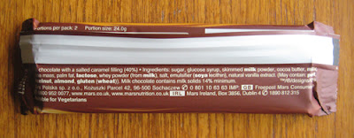
The wrapper's underside presented a pretty plain, no-thrills design. The white text was set off nice and clearly by the darker background and content didn't feel overly cluttered in.

Bar:

Mars Galaxy Caramel Collection Salted Caramel - Chocolate Bars on Wrapper

Mars Galaxy Caramel Collection Salted Caramel - Chocolate Bar Cross Section

Coming in two thin bars, this offering looked great out of the wrapper. The fingers of chocolate were elegant in appearance and the added detail of the 'G' inscription with wavy lines above and below it - picking up on the caramel theme again - gave the product a sense of class. Taking a segment, the relatively soft set caramel lusciously pulled apart leaving strands hanging out of both the piece taken and the remaining bar making seconds and thirds a very hard thing to resist. 

Taste-wise, this is where the product really excelled itself for me. The Galaxy chocolate was beautifully smooth and milky as ever but the star of the show was the filling. The addition of salt to the caramel enhanced the flavour and gave it a depth that was beyond the simplicity of a nice sugary hit. 

SUMMING UP
The wrapper design keyed in to the core brand look and had a lovely sense of sophistication and fluidity about it that picked up on the key selling points of the bar. Moreover, the flash of blue to highlight the 'salted caramel' text provided a strong point of contrast in the design and helped attract the eye when looking over the shelves. Unwrapping, the sleek fingers of chocolate were very attractive with a distinctly elegant feel to them. Taking a bite, as lovely as the milk chocolate was, the salted caramel stole the show for me. Rather than just a nice sugary hit, the caramel had a certain maturity and depth of flavour to it that proved devilishly moreish. Indeed, on taste alone, I would give this bar a hearty GBD recommendation. 

BRAND LINKS