
Established in 2009, Dorset Tea can be said to be a relatively recent addition to the Great British tea scene, especially when considering the heritage of the big brands it shares shelf space with. That said, the minds behind its success are very much seasoned when it comes to all things tea. Its founder, Keith Spicer, established his first tea company, Spicers, in 1934 aged only 24 whilst its master blenders, Tony Warr and Jimmy Medhora, boast an impressive 57 years of experience. All this wisdom has gone in to creating a wide range of teas spanning good old breakfast blends to green tea to fruit infusions. However, I'm going to begin with their signature product, 'Golden Blend', an everyday tea which not only enjoys fervent support from a number of Brits but, in testament to its quality, has also managed to retain its Great Taste Award since 2010.

THOUGHTS
Shelf standout: By virtue of the packaging's rectangular shape, the product is differentiated on the shelf given competing brands' adoption of taller, slimmer designs. Moreover, the light, summery tone of the product's imagery does well in cutting through the other packaging in the everyday tea category with their plainer, bold statements of colour. Indeed, every time I see this packaging I feel drawn in by the artwork with its romanticised vision of the English coastline.
Packaging Analysis:
- Top panel:

With the green hills and flowers in the foreground looking out to the sea's horizon where the sun radiates out from a degree of depth is created that compels the eye to immerse itself in the design. The artwork's light, fresh colours, particularly the golden hue used throughout the design, work well in conveying the product's message of naturalness and vitality. Indeed, the way in which the brand name overlaps the sun graphic helps visually underscore this link with vitality. Moreover, in wanting to capitalise on those romanticised by the imagery, the 'Live Breathe Drink' message makes explicit the connection between consuming Golden Blend and the world that is depicted. Finally, concealed tear lines in this primary panel allows the presentation to go relatively unspoiled.
- Front Panel:


Here the design from the top panel is condensed nicely so when the box is sitting flat a highly decorative and visually arresting presentation hits the eye. To open, perforations line the panel to allow for a clean tear. Moreover, to close, the lid can be simply slipped in behind the front where it will sit very snugly. Simple yet effective stuff.
- Side panels:


Plenty of effort continues to be put in to the side panels with a fun design that very much employs the same colour scheme as before to carry on the feelings of freshness and vitality. In addition, in both panels the writing and graphics feel relaxed and hand done in their stylisation making for a more personable, crafted feel.
- Back panel:

After the other panels this one may feel a bit sparse but it stops the design becoming overly busy and puts all the focus on the brand whilst maintaining the light, fresh feel.
- Bottom panel:
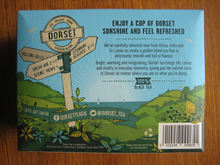
Sharing the qualities of previous panels, this one is just as engaging with a playful signpost in the foreground adding emphasis to the scenic surroundings of the depicted 'Dorset Tea' world. Of course, some text is thrown in and this is kept relatively light with a discussion of the blend and the key selling points.
Taste:


Coming in a traditional square shaped bag a generous amount of tea is given per serving that looks easily enough to give decent flavour in a large mug. To taste, the tea is indeed a well-rounded one with some malty, slightly earthy depth to it. These punchier, mature notes - a result of the Assam flexing its muscles I suspect - sat very well with me and gave the drink a distinctive character that I would happily pay for again.
SUMMING UP
The packaging has great shelf standout with imagery that draws the eye in to its romanticised vision of the English coastline. Indeed, it is obvious that a great deal of thought and effort has been put into every inch of the packaging so it can sit as a coherent whole in reinforcing the brand's core message. The tea itself is a well-rounded everyday offering with a slightly malty, earthy character that adds a depth and maturity to its taste profile. All in all, this is a strong offering from Dorset Tea that impressed me on multiple levels.
BRAND LINKS
No comments:
Post a Comment