Showing posts with label new. Show all posts

Tuesday, 9 June 2015

NEW PRODUCT: Aero Mousse Bar

With new products seemingly coming thick and fast from the big chocolate brands at the moment, I wasn't surprised to find this offering from Nestlé's Aero pop up on shelves. Admittedly, like the Toffee Crisp from yesterday, I was intrigued as I couldn't really remember the last limited edition/new product from Aero, plus I didn't know how much this 'mousse' layer would really add.


THOUGHTS
Packaging:

Like the Galaxy Salted Caramel in yesterday's post, this bar's design borrowed very heavily from the core offering in its general colour scheme and stylisation of the brand name. One addition though was, obviously, the 'mousse' text which nicely employed a fluid look and 'wispy' lines of varying stroke width to convey a notion of lightness and elegance that was very in line with the bars intention of targeting women. The product shot on the right kind of showed the mousse layer if you looked closely but, to be honest, to an eye scanning the shelves this would look like a picture of a regular piece of Aero. Lastly, a gold coloured 'new' graphic appeared in the top left though, by virtue of its positioning, I found the creases in the wrapper obscured the text. Indeed, the design looked nice enough and, in terms of brand design coherency, it was on the money. However, unlike Nestlé's Toffee Crisp Honeycomb design, it could be argued that it didn't do enough to differentiate itself on the shelf and, thus, give it sufficient personality in of its own right. 

New Nestle Aero Mousse Bar - Packaging Back (Flap Down)

New Nestle Aero Mousse Bar - Packaging Back (Flap Up)

The reverse provided the basic product information with light and dark colour used effectively against the gold backdrop to bring some clarity to the design. Moreover, the 'cocoa plan' graphic under the flap sat very nicely with the overall Aero colour scheme and, by virtue of its crisp text, reinforced a certain sense of smartness and sophistication about the bar.

Bar:

New Nestle Aero Mousse Bar - Chocolate Bar on Wrapper

Even more so than the wrapper, the bar itself remained on-brand in adopting the Aero's bubble-like segments inscribed with the brand name.    

Taste:

New Nestle Aero Mousse Bar - Chocolate Bar Cross Section

Taking a bite, the bar's aeration delivered that classic Aero textural experience of chocolate almost crumbling away in the mouth. Trying to be very aware of the textures, I do think that there was a bit more of a contrast in textures with the addition of the mousse layer but it wasn't overly apparent. That said, I found the taste incredibly smooth and light. Indeed, I felt at the very end that the bar had more perfumed my senses with the flavour of cocoa than weighed me down with it. All in all, I don't think people will think this too different to the original bar, but I did find it pleasant enough to eat and I may well consider it again if I want a light hit of milk chocolate.

SUMMING UP
Looks-wise, both the packaging and the bar were very on-brand with a lot of very strong design nods to the core offering. Indeed, as with all Aero products, it pitched itself to a female market well with its smart, elegant appearance that reinforced the lightness of the chocolate. Admittedly, I think it was so on-brand that it lacked a bit of its own personality and, certainly, didn't stand out on the shelf as well as it probably should have. Taste-wise, this bar offered beautifully smooth and light milk chocolate; however, I feel the difference between it and the core offering would, perhaps, be a little too subtle for some.

Monday, 8 June 2015

NEW PRODUCT: Galaxy Salted Caramel

Salted caramel has been a relatively big trend of recent times with it popping up in everything from supermarket offerings to restaurant menus. Therefore, it was no surprise to me to see that Mars had got on board with a new variant for their Galaxy brand of milk chocolate.  

Mars Galaxy Caramel Collection Salted Caramel - Wrapper Above

THOUGHTS
Packaging:

Mars Galaxy Caramel Collection Salted Caramel - Wrapper Front

This Galaxy variant very much employed the signature design notes of the core offering with the cursive brand name text styled after molten chocolate and a backdrop of browns, golds and yellows. The key design addition came in at the bottom where a 'wave' rises from left to right. The colour split in this wave design nicely reinforced the text displayed and the vivid blue provided a strong point of contrast to draw in the eye. Overall, I thought all components worked well together to impress upon the eye a strong sense of fluidity that was very supportive of the key caramel selling point.


Mars Galaxy Caramel Collection Salted Caramel - Wrapper Back

The wrapper's underside presented a pretty plain, no-thrills design. The white text was set off nice and clearly by the darker background and content didn't feel overly cluttered in.

Bar:

Mars Galaxy Caramel Collection Salted Caramel - Chocolate Bars on Wrapper

Mars Galaxy Caramel Collection Salted Caramel - Chocolate Bar Cross Section

Coming in two thin bars, this offering looked great out of the wrapper. The fingers of chocolate were elegant in appearance and the added detail of the 'G' inscription with wavy lines above and below it - picking up on the caramel theme again - gave the product a sense of class. Taking a segment, the relatively soft set caramel lusciously pulled apart leaving strands hanging out of both the piece taken and the remaining bar making seconds and thirds a very hard thing to resist. 

Taste-wise, this is where the product really excelled itself for me. The Galaxy chocolate was beautifully smooth and milky as ever but the star of the show was the filling. The addition of salt to the caramel enhanced the flavour and gave it a depth that was beyond the simplicity of a nice sugary hit. 

SUMMING UP
The wrapper design keyed in to the core brand look and had a lovely sense of sophistication and fluidity about it that picked up on the key selling points of the bar. Moreover, the flash of blue to highlight the 'salted caramel' text provided a strong point of contrast in the design and helped attract the eye when looking over the shelves. Unwrapping, the sleek fingers of chocolate were very attractive with a distinctly elegant feel to them. Taking a bite, as lovely as the milk chocolate was, the salted caramel stole the show for me. Rather than just a nice sugary hit, the caramel had a certain maturity and depth of flavour to it that proved devilishly moreish. Indeed, on taste alone, I would give this bar a hearty GBD recommendation. 

BRAND LINKS

LIMITED EDITION: Toffee Crisp Honeycomb

Created by Mackintosh's back in the 60's and now owned by Nestlé, the Toffee Crisp is a simple proposition combining puffed rice suspended in toffee with a milk chocolate exterior. Personally, I still love the brand and cannot help but notice its vibrant orange and yellow packaging which still feels so retro in design. Therefore, when I saw this Honeycomb limited edition offering, I was more than happy. That said, I did take pause as I realised, in a world saturated with variations on a theme, I couldn't ever remember seeing a Toffee Crisp spin-off before. Suddenly appreciating the added novelty of this happy chocolate bar encounter I just knew I had to give it a write up.

Nestle Limited Edition Toffee Crisp Honeycomb - Wrapper Front (On Angle)

THOUGHTS
Packaging:
Nestle Limited Edition Toffee Crisp Honeycomb - Wrapper Above

Nestle Limited Edition Toffee Crisp Honeycomb - Wrapper Front

Nestle Limited Edition Toffee Crisp Honeycomb - Wrapper Back

By retaining the brand's basic colour scheme of highly saturated colours, this offering felt vibrant and fun whilst visually connected to the original product. The striped nature of the background design was suitably indicative of a bee and, thus, supportive of the bar's key selling point. As for the added 'Honeycomb' serif-style text, like the brand name, it was centrally aligned and orientated in a standard fashion across the horizontal, thus, giving the bar a very balanced, classic look that spoke of reliability and trustworthiness. That said, some fun was injected in to the text with the 'o's' offset a little from word's baseline and a yellow honeycomb-shaped graphic positioned at the letters' centres.

Nestle Limited Edition Toffee Crisp Honeycomb - Wrapper Underside (Flap Down)

Nestle Limited Edition Toffee Crisp Honeycomb - Wrapper Underside (Flap Up)

The reverse provided no extra thrills in particular. Black was used very effectively to make the content stand out from the bright background, whilst further picking up on the bee connotations with the black-yellow aesthetic.

Bar:

Nestle Limited Edition Toffee Crisp Honeycomb - Bar on Wrapper

Nestle Limited Edition Toffee Crisp Honeycomb - Bar Cross Section

Sporting a nicely rippled milk chocolate exterior, the bar was a decent enough size and looked appetising. Taking a bite, textural sensations immediately hit the palette with the rice and honeycomb providing a pleasant crispiness alongside the chew of toffee. Quickly, the chewy toffee took centre stage and sweet, rich tones developed. Admittedly, at this stage I thought the flavour of the honeycomb had been overpowered by the toffee. However, as I continued to chew, I was delighted to find the honeycomb flavour emerged and eventually took centre stage itself. Admittedly, with the chocolate being as thin as it was it didn't get much of a look in, bar some general sweet milky notes, but, nevertheless, this was a tasty offering full of interest both in terms of texture and flavour.

SUMMING UP
It was nice to see Nestlé giving some attention to this brand, which had been largely left to do its own thing. The packaging was identifiably Toffee Crisp but, at the same time, built on the original design to bring a vibrant, summery tone that stood out amongst competing offerings. Whilst the bar equally tacked on a new dimension with all the textural points of interest there, as per the original, plus an undercurrent of honeycomb. Indeed, I was very impressed with the way in which the honeycomb flavour gently built up and eventually took centre stage at the end to round off the experience nicely. 

BRAND LINKS

Tuesday, 2 June 2015

NEW PACKAGING: Guinness Original

Alcohol brands don't get much more iconic than Guinness so GBD takes note when the Irish brewer overhauls its signature product with a design that, in a continuing trend, very much harks back to move forwards.

Guinness Original update - new XX heritage label design

THOUGHTS
- The Front:

Guinness Original update - new XX heritage label design

The new white label creates the white-black aesthetic used extensively in the brand's advertising to signify the drink's head and body respectively. Furthermore, the label picks up on the brand's heritage by taking inspiration from historic Guinness designs. As the back label explains in part (see image below), the red 'XX' graphic is a reference to the fact that, originally, Guinness used an increasing number of 'X's' on its porters to denote strength. In a direct comparison with today's range, the brand's high strength 'XXX' product can be equated with Guinness Foreign Extra Stout, whilst their mid-strength 'XX' product can be equated with Guinness Extra Stout or Guinness Original. Another point of interest in the design comes in the form of the text reading "Brewer's Source 1821". This is recognition of year Arthur Guinness II revised the brewery's recipe to produce Guinness Extra Superior Porter, the drink most closely associated with the stout we drink today.

Guinness Original XX update - Arthur Guinness embossed bottle signature

Also worthy of note is the nice added touch of the embossed signature towards the top of the bottle. Of course, the signature is that of the brand's originator, Arthur Guinness, and is just the sort of extra piece of detail that helps elevate this design above its predecessor.

- The Cap: 

The cap design retains a simple and smart look with homage paid to the brands origin at St James Gate, Dublin.

- The Back:


Guinness Original XX update - back label design

The label on the back is smart with gold coloured font used for the first time to distinguish the drier product information. The text at the top at the top is a nice addition with the brand providing a short explanation of the 'XX' branding and employing white font to visually connect this content back to the front label design. 

SUMMING UP
This is a smart, mature design befitting of a brand icon such as Guinness. I love how the new design pays its respect to brewer's history and the evolution in branding from 'XX' to the 'Guinness Extra Stout' or 'Guinness Original' we know today. The brief explanation on the back of the bottle aids consumers in understanding the significance of the 'XX' branding and, in my mind, can only help in further enriching the narrative of this famous drink.

BRAND LINKS  
Guinness UK Website
Guinness Facebook

Monday, 1 June 2015

NEW PRODUCT: Kellogg's Star Wars Cereal

With a new Star Wars film hitting cinemas this Christmas Kellogg's has got stuck in and released this limited-edition cereal to feed all those budding Jedi's out there. Admittedly, seeing this product on the shelf took me a little aback as it is a rare thing these days to see a film tie-in cereal and it certainly conjured up one or two childhood memories. Anyway, being a fan of Star Wars myself and seeing Kellogg's putting a bit of effort in, I couldn't resist picking up a box for the blog.

Kellogg's Star Wars Cereal Packaging - A New Force At Breakfast

THOUGHTS
Shelf standout: Scanning the shelves, the cereal box immediately got my attention by virtue of its large, crisp imagery of iconic Star Wars characters. Indeed, the imagery commanded around five-sixths of the box's height and bled right to the edges making for an eye-catching display.

Packaging analysis:
- Front panels:

Kellogg's Star Wars Cereal R2-D2 Packaging Kellogg's Star Wars Cereal Darth Vader Packaging

I say panels because either could be the front with both sporting the same graphic of the cereal and Star Wars brand name at the bottom and only differing in character images. Of course, this interesting break in front-back panel convention was the product of Kellogg's bringing a bit of creative concept to the design, that is, the two panels representing the light and dark 'sides' of the Force. Whilst I'm certainly not saying it was the most amazing thing ever, the very fact that a larger concept has been played with here is a definite step up on the creative ladder and, to be honest, heartening to see within the cereal category.

Also, very much worthy of note here is the lovely nod to advertising history with the packaging's strapline "a new Force for breakfast", which was used way back in the 80's to promote Kellogg's C-3PO's. Take a look...


- Secondary panels:

Kellogg's Star Wars Cereal Packaging

Kellogg's Star Wars Cereal Packaging

Kellogg's Star Wars Cereal Packaging Kellogg's Star Wars Cereal Packaging

As for the remaining panels there isn't really too much to say here as everything, bar the nutritional panel, has been kept rather plain. To be honest, I feel this is where the packaging let itself down a bit - the panel in which Vader's helmet simply bleeds over on to it felt a bit lazy. Indeed, with more interesting imagery, say a space battle scene, the design could of engaged from multiple angles and provided that extra sense of depth and detail. 

Taste: 

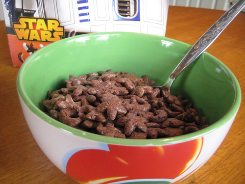
Kellogg's Star Wars Chocolate Cereal - A New Force At Breakfast

Trying a handful straight out the box my taste buds were immediately taken back to a product I haven't had for ages, Weetos. The individual pieces proved quite solid when bitten in to with a relatively dense, crunchy texture. Of course, a nice wave of cocoa - sweet but not overly so - hit the palette pretty quickly in a rather tasty and moreish way. 

With milk, the cereal proved very sturdy with little sign of sogginess whilst I was eating it. Of course, the cocoa flavour seeped out in to the milk gradually making the cereal progressively more a textural point of interest amongst a nice cocoa-infused pool of brownish milk.  

SUMMING UP
I really want to give credit to Kellogg's for injecting a bit of fun and novelty in to the cereal aisle with this tie-in offering. The willingness Kellogg's showed in breaking with convention to deliver a playful concept was great to see and a definite step in the right direction, plus the link to 80's cereal C-3PO's was a lovely nod to advertising history. As for the cereal itself, a clear attempt had been made to make it healthier, it held up in milk very well and it delivered on the taste front. Admittedly, I still think the secondary panels could have benefited from a bit more thought and, of course, I would have loved to have seen some in-box freebies but, all in all, I'm sure children up and down the country will love this.

BRAND LINKS  
Kellogg's UK Website
Kellogg's UK Twitter

Saturday, 30 May 2015

LIMITED EDITION PACKAGING: Yorkshire Tea

Following on from PG's big revamp, I thought I would do a brief review of Yorkshire Tea's limited edition 'Where The Wild Things Are' packaging that has been knocking around store shelves recently. 

Yorkshire Tea Limited Edition Where The Wild Things Are Gruffalo Packaging

THOUGHTS
Yorkshire Tea went to town with this one with a truly delightful piece of WTWTA artwork that spanned all the main panels. 

Yorkshire Tea Limited Edition Where The Wild Things Are Gruffalo Packaging

Yorkshire Tea Limited Edition Where The Wild Things Are Gruffalo Packaging - Back

Yorkshire Tea Limited Edition Where The Wild Things Are Gruffalo Packaging - SideYorkshire Tea Limited Edition Where The Wild Things Are Gruffalo Packaging - Side

The custom graphics integrated very well with the core box design and, thus, worked excellently in enhancing the sense of association between the two brands. Moreover, with small creatures of varying kind featured throughout the artwork, I felt my interest was maintained as I looked over the product. Indeed, I was charmed by the back panel in particular where a short poem about the Gruffalo "losing the deep dark wood" served as an entertaining way to relate the brand's campaign to get a million trees planted.

SUMMING UP
This was a great design from the Yorkshire Tea team that integrated seamlessly with their core look and communicated their campaign message in a way that actually put a smile on my face instead of just trying to sound worthy.

MORE INFORMATION

BRAND LINKS  
Yorkshire Tea Website

Wednesday, 27 May 2015

NEW PACKAGING: PG Tips Original

I thought I would kick things off with one of Britain's most iconic brands that has harked back to deliver us new packaging billed as its “biggest revamp in 19 years”.

New Old Packaging Comparison PG Tips Original Pyramid Tea Bags

THOUGHTS
Shelf standout: My eye was definitely caught by the front panel’s confident, clean look. By eliminating blue – which was always Tetley’s calling card - and returning to the brand’s classic white colour scheme the product immediately stood in strong visual contrast to neighbouring teas. Moreover, the tone felt unique with its move towards a more premium feel in the everyday tea category.  

Personality:
- Primary panels (front and top): 


PG Tips Original Pyramid Tea Bags White Packaging Revamp - Front

PG Tips Original Pyramid Tea Bags White Packaging Revamp - Monkey

PG Tips Original Pyramid Tea Bags White Packaging Revamp - Open Lid

This is where the design exuded a significant amount of retro charm for me with its smart text and white, stripped-back look communicating a strong, classic proposition. 


A nod to a design of old...


Retro Brooke Bond PG Tips - White Packaging

Moreover, by virtue of this look, it felt like a relatively mature, sophisticated design that leaned much more heavily towards an upmarket positioning than its predecessor. That said, upon closer inspection, the cheery, fun personality of the brand’s mascot did shine through in the subtle Monkey graphic worked in to the lid’s heritage design element.


- Side panels: 
PG Tips Original Pyramid Tea Bags White Packaging Revamp - Side

PG Tips Original Pyramid Tea Bags White Packaging Revamp - Side

Taking the box off the shelf, the sides surprised me little as a more contemporary look was exposed. The panels delivered bold red and green statements together with icon-based graphics and slightly more playful type. Plenty of visual cues linked these panels back to the primary ones but the classic-contemporary split kept them disjointed in feel for me.

- Back panel: 


PG Tips Original Pyramid Tea Bags White Packaging Revamp - Egyptian Monkey

This was where the design let its hair down a bit with some of the fun we have come to associate with the brand. The text wasn’t too exciting but the brand’s much loved Monkey character finally got a showing with a large graphic showing him sporting some nifty Egyptian gear.

SUMMING UP
Cons: Whilst positive on the whole, I thought there was room for improvement in making the design more congruous with the fun and warmth the brand’s advertising communicates. The primary panels were a strong statement for me but I thought the others could have benefited from being relaxed to give us more charm and sense of homeliness. Indeed, it might be argued that the one key property through which most people now identify with the brand, Monkey, should have been given a more salient role in the design.

Pros: Personally I loved the return to all white panels just for the interesting nod to the past they represented. But nostalgia aside, I felt shelf standout was improved, plus the clean look struck me as a confident statement amongst its competitors that spoke a bit more loudly of iconic status and quality. Moreover, the slightly cheeky, fun-loving facets of the modern brand persona were expressed – albeit in a conservative manner. Indeed, in trying to make the product ‘relevant’ to a broad spectrum of consumers, I thought there were elements that, stylistically at least, could play to young and old alike. Furthermore, credit should be given to those involved for being brave and, for better or worse, producing a very interesting design iteration.


MORE INFORMATION

BRAND LINKS  
PG Tips