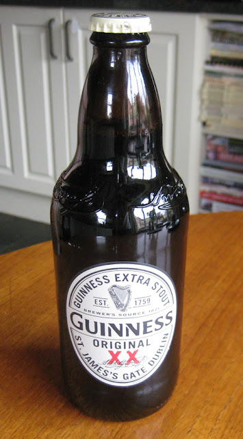
Alcohol brands don't get much more iconic than Guinness so GBD takes note when the Irish brewer overhauls its signature product with a design that, in a continuing trend, very much harks back to move forwards.
THOUGHTS
- The Front:
The new
white label creates the white-black aesthetic used
extensively in the brand's advertising to signify the drink's head and body respectively. Furthermore,
the label picks up on
the brand's heritage by taking inspiration from historic Guinness designs. As
the back label explains in part (see image below), the red 'XX' graphic is a
reference to the fact that, originally, Guinness used an increasing number of 'X's' on its porters to
denote strength. In a direct comparison with today's range, the
brand's high strength 'XXX' product can be equated with Guinness Foreign Extra Stout, whilst
their mid-strength 'XX' product can be equated with Guinness Extra Stout or Guinness
Original. Another point of interest in the design comes in the form of the text
reading "Brewer's Source 1821". This is recognition of year Arthur
Guinness II revised the brewery's recipe to produce Guinness Extra Superior
Porter, the drink most closely associated with the stout we drink today.
Also worthy of note is the nice added touch of the embossed signature towards the top of the bottle. Of course, the signature is that of the brand's originator, Arthur Guinness, and is just the sort of extra piece of detail that helps elevate this design above its predecessor.
The cap design retains a simple and smart look with homage paid to the brands origin at St James Gate, Dublin.
- The Back:
The label on the back is smart with gold coloured font used for the first time to distinguish the drier product information. The text at the top at the top is a nice addition with the brand providing a short explanation of the 'XX' branding and employing white font to visually connect this content back to the front label design.
SUMMING UP
This is a smart, mature design befitting of a brand icon such as Guinness. I love how the new design pays its respect to brewer's history and the evolution in branding from 'XX' to the 'Guinness Extra Stout' or 'Guinness Original' we know today. The brief explanation on the back of the bottle aids consumers in understanding the significance of the 'XX' branding and, in my mind, can only help in further enriching the narrative of this famous drink.
BRAND LINKS
Guinness UK Website
Guinness Facebook


No comments:
Post a Comment