Showing posts with label Fox's. Show all posts

Friday, 12 June 2015

OLD FAVOURITE: Fox's Party Rings

Long before people started reaching for the alcohol to get the party started they relied on simpler, more innocent things. Indeed, no self-respecting children's party was complete without the merry addition of Party Rings. With their cheerful packaging, brightly-coloured surfaces and sugary hit there wasn't much to not like about this brand of biscuit as a young child. 


THOUGHTS
Packaging:

The front of the packaging is as cheery as ever utilising a bright colour scheme of varying hues to impress upon the eye the feeling of energy and fun. The large brand name text is positioned on a slight diagonal and the letters are orientated at differing angles to inject a further playful spirit in to the design.


The main side of the packaging for display purposes carries on over the principal design in a nicely condensed fashion with the playful brand name featured against the biscuit decorated blue background. Moreover, Vinnie's 'quality guarantee' graphic features on the far right to help connect the product with the larger spirit of the Fox's brand. As for the other side, the primary design is cut short to allow for product information to be featured, which, at least by virtue of the bright background, doesn't feel overly dominant to the eye.


The back just includes the basic product text with a little notice to the far left referring consumer's to the product's variant, Party Footballs - a worthwhile inclusion as I didn't know this spin-off existed.

Biscuits:


Being reasonably small biscuits (around 45mm diameter), a Party Ring weighs in at a light 7g. Appearance-wise, I thought they still looked great with colourful toppings nicely finished off and decorative biscuit undersides - I particularly nice touch I thought. 

Taste-wise, well, firstly, I will say they smelt inviting with a nice sweet - but not overly so - aroma. Eating one, the biscuits provided that nice bite of biscuit and, by virtue of their topping, a slight chew which I found quite pleasant and unexpected. Moreover, I thought the biscuits were going to hit me over the head with a sugar but, again, I was surprised to find the sweetness not too intense - don't get me wrong, these will still make kid's very happy. 
  
SUMMING UP
I was pleasantly surprised with these. The packaging's design supports the biscuits positioning with its fun, vibrant overtones. The Rings themselves are still colourful and, I imagine, very attractive to the young children they are targeted at. Moreover, the biscuits aren't just a wave of sugar there is some pleasant textures to appreciate and the sweetness is not overdone. All in all, with all the nostalgia these evoked, I enjoyed this old favourite of the biscuit tin. 

BRAND LINKS

Wednesday, 10 June 2015

OLD FAVOURITE: Fox's Sports Shortcake Biscuits

Browsing the biscuit aisle in a local supermarket with the blog in mind my eyes drifted to an area so positioned as to almost demand that it be overlooked. In this land of biscuit obscurity I spotted a brand pushed right back on the shelf that I hadn't eaten let alone seen for a very long time, Fox's Sports biscuits. Getting them home and quickly researching, the only information I could glean about these little shortcake beauties was that they were invented by a chap called David Glen in 1971. Indeed, with very little background and no advertising to memory these biscuits have seemingly been left to march on all by themselves and, to that end, I thought it was about time they got some attention.      

Fox's Sports Shortcake Biscuits Packaging

THOUGHTS
Packaging:
Fox's Sports Shortcake Biscuits Packaging

Employing a red background with a large streak of light blue across it and accents of white, the basic look had a fluid, energetic feel about it that keyed in to the type of designs we've become accustomed to seeing in sports products. Building on this, the product shot was centralised to draw in the eye to the sporting depictions. This imagery worked well with the background: a streak of white lined up with the batsman to signify a ball's trajectory, and a cyclist's wheel connected with an area of red as if it was a road surface. This little interplay between the background and the product shot created a bit depth and added to the overall dynamism of the presentation. As for the 'Sports' brand name, italicisation supported the energetic feel whilst the 'stocky' font spoke of a certain solidness and dependability. 

Fox's Sports Shortcake Biscuits Packaging - Side

Fox's Sports Shortcake Biscuits Packaging - Side

The sides condensed the primary elements of the design to reinforce the sports positioning and create an appealing display angle. The little 'quality guarantee' graphic featuring the brand's panda mascot, Vinnie, was a nice touch as it brought a bit of added interest and personality to an area which is usually more of copy and paste job.

Fox's Sports Shortcake Biscuits Packaging - Underside

The underside offered the usual, no-thrills design. That said, clean lines and use of the same colour scheme brought clarity to the content and reinforced the athletic, sporting connotations of the presentation as a whole.

Biscuits:


Fox's Sports Shortcake Biscuits Packaging - Biscuits and Tea

The biscuits were pretty large but weighed in at a relatively light 8g each. On the looks front, I loved their quaint little border design and embossed sporting depictions. Obviously, the depictions weren't of the quality shown on the packaging; however, they were sufficient to imbue each biscuit with a bit of its own sporting personality. As for their taste, the biscuits gave off a lovely sweet aroma that translated to the palette in a well balanced fashion with the salt and fats included.

SUMMING UP
The packaging did well in bringing together colour scheme, graphics and font to reinforce the key sports theme. Moreover, the interplay between the product shot and background was a nice touch that brought a little bit of depth and added dynamism to the design. The biscuits themselves proved the highlight with their embossed depictions of various sports. Whilst these depictions were not of the quality on the packaging, they effectively imbued each biscuit with a bit of its own personality. Taste-wise, the flavour balanced out the sweetness in the flour mix well with salt and fat to create a lovely, well rounded offering. Indeed, it may be a simple proposition but it did the simple things well and with charm - something that will always be a winning combination in my books.

BRAND LINKS

Friday, 5 June 2015

RECENT ADDITION: Fox's Hazelnut Caffè Slices

Launched back in August 2013, the Fox's Caffè range is a relatively recent addition to a biscuit aisle still dominated by age old brands. Pitched as made-for-coffee biscuits, this proposition did get my attention at the time purely for the fact that I didn't exactly know what made a biscuit specially suited to a cup of coffee. Therefore, when I saw this product from the range, together with its caramel variant, so prominently displayed in packaging that diverges markedly from other Fox's offerings, I thought it time to give it a go for the blog.
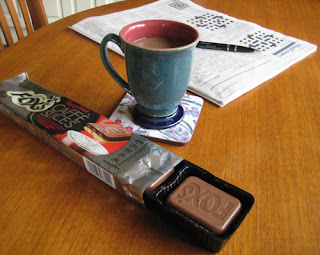
                   Fox's Hazelnut Caffè Biscuits - Pack with Coffee

THOUGHTS
Packaging:
- Primary panels: 

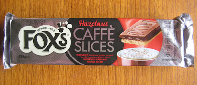
Fox's Hazelnut Caffè Biscuits Packaging - Top Bird's Eye View

Fox's Hazelnut Caffè Biscuits Pckaging - Front

In terms of the colours used, black and grey combine to give the product an air of sophistication and luxury. The presence of red injects the design with warmth and significantly amplifies the sense of indulgence felt in the product shot to the right of the panel. Basic colour principles continue to be employed well with a central black graphic accentuating the redness of the key product text, in particular, the smart 'Hazelnut' cursive text. Moreover, the creamy white of the Fox's graphic contrasts well with the other components setting it off nicely. Indeed, the three overlapping components of the Fox's graphic on the left through to the product shot on the right are visually delineated by shape and/or colour whilst sharing enough tonally to sit as a cohesive whole. 

As for the front panel, here the basic nutritional information was displayed in a manner that continued to be very clean in its lines. The only thing I will say against this area of the packaging is the positioning - I would have rather seen such content buried on the opposite panel as it does slightly detract from the main presentation angle. 

- Secondary panels:

Fox's Hazelnut Caffè Biscuits Packaging - Back

In following on from my last thought, the content pictured here on the back panel would have been ideal for the front. Its quick description of the biscuit and condensed 'Caffè Slices' graphic would have been coherent with the top panel's presentation and added that extra bit of visual impact. That said, I'm not sure why the brand chose to invert the content as it simply makes it awkward to read. 

Fox's Hazelnut Caffè Biscuits Packaging - Underneath

More basic product information was given on the bottom. Admittedly, this was a no-thrills presentation but one that retained a sense of maturity about the design and, subtly, made a visual link back to the main product logo with the small top-hat graphic on the far left.

Fox's Hazelnut Caffè Biscuits Packaging - content under flap


Looking underneath the flap a lovely bit of content was exposed. Serif-style text on the left provided a bit of historical background to the Fox's brand. Whilst, next to this, a more relaxed, sans-serif style of text quickly explained the Caffè range. This was a great touch for me that helped place the range amongst the larger brand narrative.  

Fox's Hazelnut Caffè Biscuits - Biscuits in Tray

Opening up the pack the biscuits came in a pull-out black plastic tray that was partitioned to hold three lots of two stacked biscuits. Simple and effective with my only gripe being that, just like the back panel, everything seemed inverted with the biscuit's smart Fox's branding pointing away from me.

Fox's Hazelnut Caffè Biscuits - Biscuit Chocolate Top

Fox's Hazelnut Caffè Biscuits - Biscuit Shortcake Base

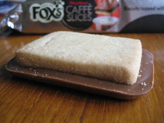
With respect to the individual biscuits, these were pretty substantial offerings. Each biscuit weighed in at roughly 23 grams (over twice the weight of the Maryland Cookies I reviewed the other day) and measured 60mm in length, 46mm in width and a decent 11mm in depth. Presentation-wise, the Fox's branding on the top was very clean and smart, there were no blemishes in the chocolate finish and the shortcake had the look of a very even bake. 

Fox's Hazelnut Caffè Biscuits - Biscuit Cross Section

Taking a bite, the hazelnut centre with its more savoury notes did come through and was a welcome contrast to the powerful wave of sweet milky chocolate that hit the palette. The shortcake biscuit had a very nice buttery taste to it but that was lost in the strong flavours of the toppings. That said, it did provide a strong textural point of interest amidst the softness of the other components. 

SUMMING UP
I felt the packaging had good shelf standout with a maturity about it that differentiated it from surrounding brands. Indeed, the principal panel design felt well thought out. Basic colour principles were effectively employed to place emphasis where need be and the stylisation of the text and graphics all worked in concert to reinforce the range's more sophisticated positioning. The biscuits themselves were relatively substantial offerings and with their clean look and Fox's branding they looked impressive. Taste-wise, sweet milky chocolate dominated the palette but the savoury notes of the nut filling did get a good look in and the shortcake provided strong textural contrast. Personally, I would have toned down the sweetness in the chocolate, but, with the bitter notes of a strong coffee to balance things out a bit, I can see many people really enjoying these 'biscwits' - as Fox's Vinnie the panda come Mafioso would say.

Anyway, I'll give the last word on the Caffè range to Vinnie himself...


BRAND LINKS