Showing posts with label limited edition. Show all posts

Wednesday, 30 March 2016

RETRO REVIVAL: McVitie's Trio

2016 Trio Bar Wrapper

Big blast from the past time. Trio, a marriage of biscuit, toffee and chocolate originally manufactured by Jacob's, once again graces store shelves! The revival has come as a result of McVitie's - present owner of the Jacob's brand - giving in to what it described as "massive consumer demand". That said, it's only a limited edition return for this cult classic so I was keen to try it out to see if the 2016 version is worth stocking up on. 

2016 Trio Multipack Wrapper

2016 Trio Multipack Wrapper

Presentation-wise, the multi-pack design is instantly recognisable as it borrows straight from the late 80's/90's look. Indeed, the brand name typeface directly picks up on the advertising from yesteryear in which an animated girl called Suzy would shout 'Trio' repeatedly - if you're not familiar with this, see the end of this post. To be honest, on today's shelves the design still works really well with the loud presentation feeling sufficiently differentiated amongst the mass of competing offerings. 

2016 Trio Bar Wrapper

2016 Trio Bar Wrapper

Moving on to the design of the individual bars, the artwork condenses down really neatly and I am delighted by the use of paper. On the latter point, I've written about this before, but, generally, I really dislike brands use of plastic as the go-to option. I say this purely on aesthetic grounds as, for me, plastic just signals cheapness and mass production. On the other hand, glass, foil, paper, card etc generally make a product feel a bit more special and cared for - even if that isn't the case at all.


2016 Trio Bar Unwrapped

As for the look of the bar itself, there's no lack of character as it harks back to the original with three segments sporting an embossed 'Trio' brand name.


2016 Trio Bar Cross Section

Taste-wise, I'm very glad to say the 2016 Trio hits the spot. Expecting an overly hefty dose of sugar to overwhelm the palate, I was delighted to find they've been pretty restrained. Indeed, the biscuit layer is really quite plain and the chocolate boasts nice milky, cocoa flavours rather than pure sweetness. All of this provides perfect support for the sweeter toffee cream layer creating a balanced and rather tasty offering.

In summary, these bars are a great throw back with a few modern temptations pleasingly avoided. Moreover, the bars taste great with all three layers adding something different whilst complementing one another. These get a definite GBD thumbs up from me. 

Oh, and on the advertising front it's worth mentioning that McVitie's are currently looking for people to feature in the bar's new ad. If you're interested, see here - you'll need to scroll down the page for details. That aside, this wouldn't be a retro revival post without indulging in some advertising nostalgia...


BRAND LINKS
McVitie's Website
McVitie's Twitter
United Biscuits Website - McVitie's Page

Saturday, 28 November 2015

LIMITED EDITION PRODUCT: Walkers Sensations Thicker Cut Crisps Cheese with Sweet Cranberry


Launching back in 2002, Sensations hit the shelves as Walkers 'posh' crisps. Since then, the likes of the Caramelised Onions and Balsamic Vinegar offering have become a popular feature in the GBD household with a bag or two invariably tucked in to over the festive period. Therefore, when I spotted this limited edition cheese and cranberry combination the other day I was more than intrigued to see how it measured up. 


I was immediately impressed by the packaging's design. I loved the festive-looking curls of green and red circles accenting both the top and bottom of the packet - presumably signifying a cranberry bush. The central graphic burst with colour and, together with the gold-coloured Christmas tree motif, made for a particularly elegant and visually-arresting design. The packaging's reverse also sported a nice design down the left-hand side with graphics picked up from the front and well thought out text complementing the ensemble beautifully. Top marks on this.


As for the crisps themselves, well, unfortunately, this is where the product fell flat on its face for me. In my head, the flavour combination sounded great and, based on past experiences, I expected some good quality flavours; however, to be frank, these tasted like a cheap packet of cheese crisps. Indeed, the cranberry was a bit lost on me and the cheese flavour was rather too reminiscent of Quavers - something you don't want when paying for a more expensive packet of crisps. 

All in all, the packaging's design was top notch but, with a cheap tasting cheese powder flavour, the crisps failed completely to deliver the quality expected of a brand like this. A disappointment.

Thursday, 26 November 2015

CHRISTMAS PACKAGING: Colman's Sauce


In another very quick look at some festive packaging doing the rounds, I spotted these lovely traditional designs from iconic brand Colman's. Featuring snow-covered scenery, the mint and seafood sauce artwork directly picks up on the key ingredient whilst the horseradish is a little more subtle. Personally, I'm particularly fond of the mint sauce with its robin but these are all really nice and a welcome sight.

Here's a closer look at these limited edition designs:


BRAND LINKS

Monday, 23 November 2015

LIMITED EDITION PACKAGING: Nestle Aero by Matthew Williamson


Admittedly, my knowledge of fashion is such that the packaging's reference to a 'Matthew Williamson' was entirely meaningless to me - then again I'm not the supposed 35-54 year old female target market. Googling, I found out that the man was a notable British fashion designer and the wrapper design was an update on his signature 'butterfly' print. Personally, I loved these snazzy redesigns. They remained loyal to the general Aero look whilst delivering boat loads of interest to reinvigorate shelf standout. Indeed, I can see these playing to an even broader age range than that suggested. 
A definite thumbs up to Nestle on this one. Here are the designs in full:


BRAND LINKS

Sunday, 22 November 2015

OUT AND ABOUT: Greggs Festive Bake

I was out and about in my local town centre yesterday and just before I hopped in the car to scoot back home I thought I would pop in to Greggs to see what festive offerings they were serving up. Their tasty sounding Christmas wrap was sold out but looking at the counter I was delighted to see their Festive Bake had returned. With Greggs Steak Bake being a guilty pleasure of mine, I remember trying this festive alternative and being really quite taken by it. To that end, I was more than eager to see if this year's version lived up to the memory. 


First off, I should say that the staff member serving me was full of smiles and really made for a warm and welcome experience so top marks go to Greggs Penrith on service. Moreover, in what I thought made for a nice touch, my meal deal cup of tea came in jolly festive cup with a lovely warm red colour scheme. 


As for the bake, its festive paper bag sported a similarly red colour scheme complemented by an amusing Santa beard and hashtag.  Removing the packaging, and barring the dent I made in the top, I thought the product looked great. Indeed, the pastry was beautifully golden with a nice crispy look to it - I actually thought it looked better than the product shot.  


Moving on to the taste, the smell of the sage stuffing was more than apparent and certainly whetted my appetite. Biting in, this smell translated to the palette with the sage bounding through on a glorious wave of creamy sauce punctuated by occasional chunks of meaty chicken breast and sweet bursts of cranberry. Yes, perhaps in an ideal world, I would have liked more chicken and, admittedly, the strips of bacon were a bit lost on me. That said, for the price and the relatively small parcel they're trying to cram all these ingredients in to, Greggs gets top marks from me again on this one. That sage stuffing is a triumph.

Warm, tasty fare that is sure to get you in the festive spirit. Pity it's around for a limited time only.

BRAND LINKS

Friday, 20 November 2015

CHRISTMAS PACKAGING: Kellogg's Corn Flakes

With Christmas adverts doing the rounds and lots on tempting goodies on shelves, we're fast approaching merry December. Not wanting to miss out on the action, Kellogg's have rolled out some limited edition Christmas packaging for four of its classic offerings. The children's cereals, Frosties, Coco Pops and Rice Krispies, are all bright and fun with their respective mascots donning Santa hats in front of Christmas tree-decorated backgrounds. 


That said, most interesting of all is the more traditional packaging for Corn Flakes given that it completely breaks with the cereal's usual look. A lovely, traditional-looking depiction of Santa by Norman Rockwell features front and centre against a snowy white background. In a couple of other touches, one of the side panels includes the full words to 'Twas the Night Before Christmas' and the bottom panel sports a nicely condensed version of the primary graphic. Indeed, the packaging is eye catching, hits the right tone for this most iconic of cereals and links in well with the brand's classic Santa Claus advert - soon to appear on screens I'm sure. Anyway, having picked up a box, here's all the pictures of the design:


BRAND LINKS
Kellogg's UK Website
Kellogg's UK Twitter

Wednesday, 24 June 2015

NEWS: Angel Delight, Galaxy, Marmite and Roses

Angel Delight: A recent study has found Angel Delight to be the nation's most beloved childhood dish with consumers commenting that it evoked strong memories of birthdays and summertime. Personally, on just the desserts and puddings front, I would have gone with something like a traditional homemade crumble or steamed pudding having grown up with my family's wonderful Sunday Dinners. Then again, everyone to their own.


Galaxy: Mars has added two new permanent additions to its Galaxy range under the name, 'Duet Bars'. The bars will feature two flavours - 'Cookies and Cream' and 'Caramel and Shortcake' - which will separately flavour the chocolate allowing consumer to choose whether they eat just one flavour at a time or both simultaneously. Retailing at 60p each, expect to see these bars in stores come August.

For a look at the product and to read more: http://www.fdin.org.uk/2015/06/mars-launches-new-galaxy-duet-bars/

Marmite: It's summer so Marmite have decided to release a limited edition spread made with lager yeast. Apparently, this special yeast will make the spread a light, summery one. The product will come in two jars, ‘Summer of Love’ and ‘Summer of Hate’, which will sport illustrations inspired by the 60's. Moreover, only 94 'Summer of Hate' jars will be released nationally making them a fun collectors item. The jars are expected to retail at £3.49.


Roses: Cadbury has redesigned its iconic Roses carton, first released in 1938. A concave top has been applied to the carton's body to carve out a more distinctive look on store shelves. The new packaging will also be brought in for Cadbury Heroes and Terry’s Chocolate Orange Segsations.

Friday, 19 June 2015

NEWS: Weetabix and Cadbury launch new products

Weetabix Protein Crunch 
Weetabix is launching two new cereals under the 'Protein Crunch' brand name to target consumers wanting more protein in their foods. This move comes after the cereal manufacturer kicked off a new advertising campaign, entitled 'Weetabix. Incredible Inside'. The campaign focuses on the feats the human body manages to perform on a daily basis and how Weetabix's portfolio is, apparently, nutritionally designed to support such performance.  Personally, I think this is an interesting move as the market for protein offerings is certainly out there to be capitalised on by cereal manufacturers. However, credibility will be an issue and, thus, communications will be crucial in convincing health-conscious consumers of the health benefits. 

For more information see here

Cadbury Strawberries & Creme 
It's that time of year again when strawberries and cream will soon be reappearing at Wimbledon for the tennis. Therefore, Cadbury have decided, once again, to bring out their Strawberries & Creme flavoured Dairy Milk tablet. This bar was initially launched in Summer 2013 and consists of the manufacturer's signature milk chocolate with a strawberry filling thrown in. Indeed, if you like your Dairy Milk you may well want to give this limited edition offering a look before it goes.  

For more information see here

Friday, 12 June 2015

NEWS: Honey Monster Puffs gets Minions makeover

Screenshot of third-party source
To tie in with the soon to be released Minion film, Honey Monster Puffs is releasing a limited edition version of the cereal. The product will include Minion graphics on pack (as above) and the cereal will feature banana-flavoured 'crispies'. 

From just the product images circulating online, my first impression of the design is very good. I think the front panel artwork with the Minions popping out on the right hand side of the design captures the quirky, fun element of the characters. Moreover, the prominent blue and yellow of the basic design keys in extremely well with the Minion look. Also, I have to say I was amused by the notion of these yellow creatures getting behind a Monster-based cereal - very Minion-esque indeed. As for the other panels, I am pleased to see that some thought has been put in to the side panels with one providing a relatively large piece of Minions content. Finally, the back panel sports a very large Minion cut-out allowing for some good old on-the-box fun.

All in all, this looks promising. If I spot a box when it hits the shelves I'll be sure to give it a GBD write up.

If you are after more things Honey Monster related, please see my original website reviews of the brand's products...

GBD LINKS:

Monday, 8 June 2015

LIMITED EDITION: Toffee Crisp Honeycomb

Created by Mackintosh's back in the 60's and now owned by Nestlé, the Toffee Crisp is a simple proposition combining puffed rice suspended in toffee with a milk chocolate exterior. Personally, I still love the brand and cannot help but notice its vibrant orange and yellow packaging which still feels so retro in design. Therefore, when I saw this Honeycomb limited edition offering, I was more than happy. That said, I did take pause as I realised, in a world saturated with variations on a theme, I couldn't ever remember seeing a Toffee Crisp spin-off before. Suddenly appreciating the added novelty of this happy chocolate bar encounter I just knew I had to give it a write up.

Nestle Limited Edition Toffee Crisp Honeycomb - Wrapper Front (On Angle)

THOUGHTS
Packaging:
Nestle Limited Edition Toffee Crisp Honeycomb - Wrapper Above

Nestle Limited Edition Toffee Crisp Honeycomb - Wrapper Front

Nestle Limited Edition Toffee Crisp Honeycomb - Wrapper Back

By retaining the brand's basic colour scheme of highly saturated colours, this offering felt vibrant and fun whilst visually connected to the original product. The striped nature of the background design was suitably indicative of a bee and, thus, supportive of the bar's key selling point. As for the added 'Honeycomb' serif-style text, like the brand name, it was centrally aligned and orientated in a standard fashion across the horizontal, thus, giving the bar a very balanced, classic look that spoke of reliability and trustworthiness. That said, some fun was injected in to the text with the 'o's' offset a little from word's baseline and a yellow honeycomb-shaped graphic positioned at the letters' centres.

Nestle Limited Edition Toffee Crisp Honeycomb - Wrapper Underside (Flap Down)

Nestle Limited Edition Toffee Crisp Honeycomb - Wrapper Underside (Flap Up)

The reverse provided no extra thrills in particular. Black was used very effectively to make the content stand out from the bright background, whilst further picking up on the bee connotations with the black-yellow aesthetic.

Bar:

Nestle Limited Edition Toffee Crisp Honeycomb - Bar on Wrapper

Nestle Limited Edition Toffee Crisp Honeycomb - Bar Cross Section

Sporting a nicely rippled milk chocolate exterior, the bar was a decent enough size and looked appetising. Taking a bite, textural sensations immediately hit the palette with the rice and honeycomb providing a pleasant crispiness alongside the chew of toffee. Quickly, the chewy toffee took centre stage and sweet, rich tones developed. Admittedly, at this stage I thought the flavour of the honeycomb had been overpowered by the toffee. However, as I continued to chew, I was delighted to find the honeycomb flavour emerged and eventually took centre stage itself. Admittedly, with the chocolate being as thin as it was it didn't get much of a look in, bar some general sweet milky notes, but, nevertheless, this was a tasty offering full of interest both in terms of texture and flavour.

SUMMING UP
It was nice to see Nestlé giving some attention to this brand, which had been largely left to do its own thing. The packaging was identifiably Toffee Crisp but, at the same time, built on the original design to bring a vibrant, summery tone that stood out amongst competing offerings. Whilst the bar equally tacked on a new dimension with all the textural points of interest there, as per the original, plus an undercurrent of honeycomb. Indeed, I was very impressed with the way in which the honeycomb flavour gently built up and eventually took centre stage at the end to round off the experience nicely. 

BRAND LINKS

Wednesday, 3 June 2015

ANNIVERSARY SPECIAL: Chewits at 50

I like to chewit, chewit...I like to...CHEWIT! The line that invariably plays in my mind like a broken record whenever this icon of the sweet aisle pops up on my GBD radar. Indeed, with Chewits turning the big 50 this year and lots of brand activity surrounding the sweet's anniversary I'm sure this line will, justly, be given lots of airing along with the good old 'Muncher' - the answer to what Godzilla would be like if he had a sweet tooth. So, without further ado, lets kick off this nostalgia fest come whirlwind journey through Chewits' history with the ads.

50 Years of Chewits Advertising
To begin, the brand's very first advert from 1976 - an absolutely fabulous claymation piece that introduced the world to the Muncher...


Carrying on from the 70's, in what was, for me at least, the golden period of the brand's advertising, is a great 80's advert humorously playing on old war advertising...


In the 90's Muncher took on a slightly different, more colourful look with, firstly, a humorous ad that plays on the exaggerated tone of post-war advertising...


Then Chewits begun experimenting with puppet versions of the Muncher...


The 90's saw the eventual demise of the claymation or puppet-based Muncher with the introduction of a 2D animated character called Chewie the Chewitsaurus. Admittedly, as a practical effects aficionado, this was a real pity to me but, nevertheless, the tone was kept fun, colourful and upbeat, plus we gained a very catchy jingle...


In this 00's ad we see Chewie look looking rounder and, gerenally, more friendly in appearance...


Finally, in what I presume was the effect of new legislation coming in limiting brands' ability to advertise to children, Chewie/Muncher disappeared from our TV screens. That said, the mascot was redesigned in 2009 to give it a younger, slicker look. This new look character appeared in a variety of brand materials, including an animated Christmas card, which the following is a screenshot from:


50 Years of Chewits Packaging
Starting off in the 70's again, the packs keep things very simple. The background sports a decidedly groovy looking design with waves of colour to signify the different varieties of flavour. As for brand name, it is occupies a straight-forward central positioning with rounded, informal font that employs white and a bit of drop show to stand out as prominently as possible from the background.  


Chewits 50th Anniversary - packaging from 1976 advert

Moving on to the 80's and the brand occupies a more asymmetrical, off-centre positioning so the design can accommodate the inclusion of relevant fruit-themed graphics. 

Chewits 50th Anniversary - 80's packaging from adverts

As for the 90's, the packaging on the left carries on the look adopted in the 80's. However, the packaging underwent a distinct evolution as the decade progressed and Chewie the Chewitsaurus arrived on the scene. Indeed, in line with the added vibrancy and animation of the new mascot, the pack design stepped up the fun factor. The brand name moved back to a more central positioning but, for the first time, the characters carved out a rather irregular line generating a sense of movement. Also for the first time the mascot featured on the pack with a graphic showing Chewie's yellow and green striped body stretched right across the design. All in all, the pack lost its 70's waves of background colour but it gained a healthy injection of fun and personality with Chewie's introduction. 

Chewits 50th Anniversary - 90's packaging from adverts

Moving through to the end of the 00's Chewie was markedly redesigned and, in line with this, the pack went through another distinct change. The characters in the brand name reverted to the straight line of old whilst the 'Chewits' text went over to the right end of the pack. As for Chewie and the fruit graphics they combined in an image on the left showing mascot splattering fruit juice everywhere. Moreover, above this Chewie graphic, which spanned two sides, the brand's website address stretched the length of the design. Indeed, this may not have been quite as colourful as its predecessors but Chewie's graphic did sustain a level of fun and energy in the design.  

Chewits 50th Anniversary - 00's packaging


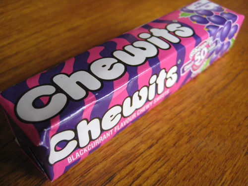
Finally, to today's limited edition Chewits packaging celebrating the brand's anniversary. The following design for their blackcurrant variant omitted Chewie from the pack's exterior and harked right back to the brand's earliest designs with the re-introduction of those waves of colour. Like some of the 80's and early 90's designs, the Chewits brand name was off to left and the fruit graphic was back on the right end of the pack. As for the sweets themselves, the nods to designs of old were brought full circle with the modern Chewie featured in a fun little wrapper graphic. 


Oh and, as for the taste, Chewits remain as good as ever. The chews are nice and juicy - not too hard or soft - with a pleasant undercurrent of blackcurrant that isn't overpowered by sweetness. Simple, effective stuff very well done.   


SUMMING UP
Chewits has gone on from its humble beginnings in Southport in the mid 60's to become a true brand icon of the Great British Diet. Stellar advertising has left many Brits with fond memories of both the Muncher and Chewie the Chewitsaurus rampaging through the streets to tunes that span all the way from wartime to the modern day. Moreover, the sweets themselves, whilst naturally evolving in design, have manged to retain the vibrancy, colour and fun that characterised the brand from its very beginning. All in all, a fun, great tasting chew that is full of nostalgia and has us keep coming back for more. Indeed, I have no doubt many a Brit will be carrying their 'regulation Chewits' for a long time to come.

BRAND LINKS

Monday, 1 June 2015

NEW PRODUCT: Kellogg's Star Wars Cereal

With a new Star Wars film hitting cinemas this Christmas Kellogg's has got stuck in and released this limited-edition cereal to feed all those budding Jedi's out there. Admittedly, seeing this product on the shelf took me a little aback as it is a rare thing these days to see a film tie-in cereal and it certainly conjured up one or two childhood memories. Anyway, being a fan of Star Wars myself and seeing Kellogg's putting a bit of effort in, I couldn't resist picking up a box for the blog.

Kellogg's Star Wars Cereal Packaging - A New Force At Breakfast

THOUGHTS
Shelf standout: Scanning the shelves, the cereal box immediately got my attention by virtue of its large, crisp imagery of iconic Star Wars characters. Indeed, the imagery commanded around five-sixths of the box's height and bled right to the edges making for an eye-catching display.

Packaging analysis:
- Front panels:

Kellogg's Star Wars Cereal R2-D2 Packaging Kellogg's Star Wars Cereal Darth Vader Packaging

I say panels because either could be the front with both sporting the same graphic of the cereal and Star Wars brand name at the bottom and only differing in character images. Of course, this interesting break in front-back panel convention was the product of Kellogg's bringing a bit of creative concept to the design, that is, the two panels representing the light and dark 'sides' of the Force. Whilst I'm certainly not saying it was the most amazing thing ever, the very fact that a larger concept has been played with here is a definite step up on the creative ladder and, to be honest, heartening to see within the cereal category.

Also, very much worthy of note here is the lovely nod to advertising history with the packaging's strapline "a new Force for breakfast", which was used way back in the 80's to promote Kellogg's C-3PO's. Take a look...


- Secondary panels:

Kellogg's Star Wars Cereal Packaging

Kellogg's Star Wars Cereal Packaging

Kellogg's Star Wars Cereal Packaging Kellogg's Star Wars Cereal Packaging

As for the remaining panels there isn't really too much to say here as everything, bar the nutritional panel, has been kept rather plain. To be honest, I feel this is where the packaging let itself down a bit - the panel in which Vader's helmet simply bleeds over on to it felt a bit lazy. Indeed, with more interesting imagery, say a space battle scene, the design could of engaged from multiple angles and provided that extra sense of depth and detail. 

Taste: 

Kellogg's Star Wars Chocolate Cereal - A New Force At Breakfast

Trying a handful straight out the box my taste buds were immediately taken back to a product I haven't had for ages, Weetos. The individual pieces proved quite solid when bitten in to with a relatively dense, crunchy texture. Of course, a nice wave of cocoa - sweet but not overly so - hit the palette pretty quickly in a rather tasty and moreish way. 

With milk, the cereal proved very sturdy with little sign of sogginess whilst I was eating it. Of course, the cocoa flavour seeped out in to the milk gradually making the cereal progressively more a textural point of interest amongst a nice cocoa-infused pool of brownish milk.  

SUMMING UP
I really want to give credit to Kellogg's for injecting a bit of fun and novelty in to the cereal aisle with this tie-in offering. The willingness Kellogg's showed in breaking with convention to deliver a playful concept was great to see and a definite step in the right direction, plus the link to 80's cereal C-3PO's was a lovely nod to advertising history. As for the cereal itself, a clear attempt had been made to make it healthier, it held up in milk very well and it delivered on the taste front. Admittedly, I still think the secondary panels could have benefited from a bit more thought and, of course, I would have loved to have seen some in-box freebies but, all in all, I'm sure children up and down the country will love this.

BRAND LINKS  
Kellogg's UK Website
Kellogg's UK Twitter