
I like to chewit, chewit...I like to...CHEWIT! The line that invariably plays in my mind like a broken record whenever this icon of the sweet aisle pops up on my GBD radar. Indeed, with Chewits turning the big 50 this year and lots of brand activity surrounding the sweet's anniversary I'm sure this line will, justly, be given lots of airing along with the good old 'Muncher' - the answer to what Godzilla would be like if he had a sweet tooth. So, without further ado, lets kick off this nostalgia fest come whirlwind journey through Chewits' history with the ads.
50 Years of Chewits Advertising
To begin, the brand's very first advert from 1976 - an absolutely fabulous claymation piece that introduced the world to the Muncher...
Carrying on from the 70's, in what was, for me at least, the golden period of the brand's advertising, is a great 80's advert humorously playing on old war advertising...
In the 90's Muncher took on a slightly different, more colourful look with, firstly, a humorous ad that plays on the exaggerated tone of post-war advertising...
Then Chewits begun experimenting with puppet versions of the Muncher...
The 90's saw the eventual demise of the claymation or puppet-based Muncher with the introduction of a 2D animated character called Chewie the Chewitsaurus. Admittedly, as a practical effects aficionado, this was a real pity to me but, nevertheless, the tone was kept fun, colourful and upbeat, plus we gained a very catchy jingle...
In this 00's ad we see Chewie look looking rounder and, gerenally, more friendly in appearance...
Finally, in what I presume was the effect of new legislation coming in limiting brands' ability to advertise to children, Chewie/Muncher disappeared from our TV screens. That said, the mascot was redesigned in 2009 to give it a younger, slicker look. This new look character appeared in a variety of brand materials, including an animated Christmas card, which the following is a screenshot from:

50 Years of Chewits Packaging
Starting off in the 70's again, the packs keep things very simple. The background sports a decidedly groovy looking design with waves of colour to signify the different varieties of flavour. As for brand name, it is occupies a straight-forward central positioning with rounded, informal font that employs white and a bit of drop show to stand out as prominently as possible from the background.

Moving on to the 80's and the brand occupies a more asymmetrical, off-centre positioning so the design can accommodate the inclusion of relevant fruit-themed graphics.

As for the 90's, the packaging on the left carries on the look adopted in the 80's. However, the packaging underwent a distinct evolution as the decade progressed and Chewie the Chewitsaurus arrived on the scene. Indeed, in line with the added vibrancy and animation of the new mascot, the pack design stepped up the fun factor. The brand name moved back to a more central positioning but, for the first time, the characters carved out a rather irregular line generating a sense of movement. Also for the first time the mascot featured on the pack with a graphic showing Chewie's yellow and green striped body stretched right across the design. All in all, the pack lost its 70's waves of background colour but it gained a healthy injection of fun and personality with Chewie's introduction.

Moving through to the end of the 00's Chewie was markedly redesigned and, in line with this, the pack went through another distinct change. The characters in the brand name reverted to the straight line of old whilst the 'Chewits' text went over to the right end of the pack. As for Chewie and the fruit graphics they combined in an image on the left showing mascot splattering fruit juice everywhere. Moreover, above this Chewie graphic, which spanned two sides, the brand's website address stretched the length of the design. Indeed, this may not have been quite as colourful as its predecessors but Chewie's graphic did sustain a level of fun and energy in the design.

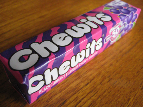
Finally, to today's limited edition Chewits packaging celebrating the brand's anniversary. The following design for their blackcurrant variant omitted Chewie from the pack's exterior and harked right back to the brand's earliest designs with the re-introduction of those waves of colour. Like some of the 80's and early 90's designs, the Chewits brand name was off to left and the fruit graphic was back on the right end of the pack. As for the sweets themselves, the nods to designs of old were brought full circle with the modern Chewie featured in a fun little wrapper graphic.


Oh and, as for the taste, Chewits remain as good as ever. The chews are nice and juicy - not too hard or soft - with a pleasant undercurrent of blackcurrant that isn't overpowered by sweetness. Simple, effective stuff very well done.

SUMMING UP
Chewits has gone on from its humble beginnings in Southport in the mid 60's to become a true brand icon of the Great British Diet. Stellar advertising has left many Brits with fond memories of both the Muncher and Chewie the Chewitsaurus rampaging through the streets to tunes that span all the way from wartime to the modern day. Moreover, the sweets themselves, whilst naturally evolving in design, have manged to retain the vibrancy, colour and fun that characterised the brand from its very beginning. All in all, a fun, great tasting chew that is full of nostalgia and has us keep coming back for more. Indeed, I have no doubt many a Brit will be carrying their 'regulation Chewits' for a long time to come.
BRAND LINKS
No comments:
Post a Comment