Salted caramel has been a relatively big trend of recent times with it popping up in everything from supermarket offerings to restaurant menus. Therefore, it was no surprise to me to see that Mars had got on board with a new variant for their Galaxy brand of milk chocolate.
THOUGHTS
Packaging:
This Galaxy variant very much employed the signature design notes of the core offering with the cursive brand name text styled after molten chocolate and a backdrop of browns, golds and yellows. The key design addition came in at the bottom where a 'wave' rises from left to right. The colour split in this wave design nicely reinforced the text displayed and the vivid blue provided a strong point of contrast to draw in the eye. Overall, I thought all components worked well together to impress upon the eye a strong sense of fluidity that was very supportive of the key caramel selling point.
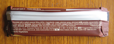
The wrapper's underside presented a pretty plain, no-thrills design. The white text was set off nice and clearly by the darker background and content didn't feel overly cluttered in.
Bar:
Coming in two thin bars, this offering looked great out of the wrapper. The fingers of chocolate were elegant in appearance and the added detail of the 'G' inscription with wavy lines above and below it - picking up on the caramel theme again - gave the product a sense of class. Taking a segment, the relatively soft set caramel lusciously pulled apart leaving strands hanging out of both the piece taken and the remaining bar making seconds and thirds a very hard thing to resist.
Taste-wise, this is where the product really excelled itself for me. The Galaxy chocolate was beautifully smooth and milky as ever but the star of the show was the filling. The addition of salt to the caramel enhanced the flavour and gave it a depth that was beyond the simplicity of a nice sugary hit.
SUMMING UP
The wrapper design keyed in to the core brand look and had a lovely sense of sophistication and fluidity about it that picked up on the key selling points of the bar. Moreover, the flash of blue to highlight the 'salted caramel' text provided a strong point of contrast in the design and helped attract the eye when looking over the shelves. Unwrapping, the sleek fingers of chocolate were very attractive with a distinctly elegant feel to them. Taking a bite, as lovely as the milk chocolate was, the salted caramel stole the show for me. Rather than just a nice sugary hit, the caramel had a certain maturity and depth of flavour to it that proved devilishly moreish. Indeed, on taste alone, I would give this bar a hearty GBD recommendation.
BRAND LINKS


No comments:
Post a Comment