Showing posts with label drink. Show all posts

Wednesday, 3 June 2015

RECENT ADDITION: Dorset Tea Golden Blend

Established in 2009, Dorset Tea can be said to be a relatively recent addition to the Great British tea scene, especially when considering the heritage of the big brands it shares shelf space with. That said, the minds behind its success are very much seasoned when it comes to all things tea. Its founder, Keith Spicer, established his first tea company, Spicers, in 1934 aged only 24 whilst its master blenders, Tony Warr and Jimmy Medhora, boast an impressive 57 years of experience. All this wisdom has gone in to creating a wide range of teas spanning good old breakfast blends to green tea to fruit infusions. However, I'm going to begin with their signature product, 'Golden Blend', an everyday tea which not only enjoys fervent support from a number of Brits but, in testament to its quality, has also managed to retain its Great Taste Award since 2010. 

Dorset Tea Golden Blend Packaging

THOUGHTS
Shelf standout: By virtue of the packaging's rectangular shape, the product is differentiated on the shelf given competing brands' adoption of taller, slimmer designs. Moreover, the light, summery tone of the product's imagery does well in cutting through the other packaging in the everyday tea category with their plainer, bold statements of colour. Indeed, every time I see this packaging I feel drawn in by the artwork with its romanticised vision of the English coastline. 

Packaging Analysis:
- Top panel:
Dorset Tea Golden Blend Packaging - Top Panel

With the green hills and flowers in the foreground looking out to the sea's horizon where the sun radiates out from a degree of depth is created that compels the eye to immerse itself in the design. The artwork's light, fresh colours, particularly the golden hue used throughout the design, work well in conveying the product's message of naturalness and vitality. Indeed, the way in which the brand name overlaps the sun graphic helps visually underscore this link with vitality. Moreover, in wanting to capitalise on those romanticised by the imagery, the 'Live Breathe Drink' message makes explicit the connection between consuming Golden Blend and the world that is depicted. Finally, concealed tear lines in this primary panel allows the presentation to go relatively unspoiled. 

- Front Panel:
Dorset Tea Golden Blend Packaging - Front Panel

Dorset Tea Golden Blend Packaging - Open Pack

Here the design from the top panel is condensed nicely so when the box is sitting flat a highly decorative and visually arresting presentation hits the eye. To open, perforations line the panel to allow for a clean tear. Moreover, to close, the lid can be simply slipped in behind the front where it will sit very snugly. Simple yet effective stuff.

- Side panels:

Dorset Tea Golden Blend Packaging - Side Panel Brewing InstructionsDorset Tea Golden Blend Packaging - Side Panel Product Info

Plenty of effort continues to be put in to the side panels with a fun design that very much employs the same colour scheme as before to carry on the feelings of freshness and vitality. In addition, in both panels the writing and graphics feel relaxed and hand done in their stylisation making for a more personable, crafted feel. 

Back panel:


Dorset Tea Golden Blend Packaging - Back Panel

After the other panels this one may feel a bit sparse but it stops the design becoming overly busy and puts all the focus on the brand whilst maintaining the light, fresh feel.

- Bottom panel:
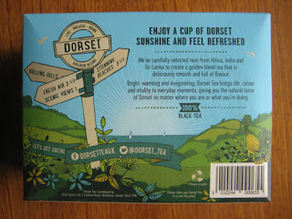
                                Dorset Tea Golden Blend Packaging - Bottom Panel

Sharing the qualities of previous panels, this one is just as engaging with a playful signpost in the foreground adding emphasis to the scenic surroundings of the depicted 'Dorset Tea' world. Of course, some text is thrown in and this is kept relatively light with a discussion of the blend and the key selling points. 

Taste:

Dorset Tea Golden Blend Packaging - Square Tea Bag in Cup


Dorset Tea Golden Blend Packaging - Cup of Tea

Coming in a traditional square shaped bag a generous amount of tea is given per serving that looks easily enough to give decent flavour in a large mug. To taste, the tea is indeed a well-rounded one with some malty, slightly earthy depth to it. These punchier, mature notes - a result of the Assam flexing its muscles I suspect - sat very well with me and gave the drink a distinctive character that I would happily pay for again. 

SUMMING UP
The packaging has great shelf standout with imagery that draws the eye in to its romanticised vision of the English coastline. Indeed, it is obvious that a great deal of thought and effort has been put into every inch of the packaging so it can sit as a coherent whole in reinforcing the brand's core message. The tea itself is a well-rounded everyday offering with a slightly malty, earthy character that adds a depth and maturity to its taste profile. All in all, this is a strong offering from Dorset Tea that impressed me on multiple levels.

BRAND LINKS

Tuesday, 2 June 2015

NEW PACKAGING: Guinness Original

Alcohol brands don't get much more iconic than Guinness so GBD takes note when the Irish brewer overhauls its signature product with a design that, in a continuing trend, very much harks back to move forwards.

Guinness Original update - new XX heritage label design

THOUGHTS
- The Front:

Guinness Original update - new XX heritage label design

The new white label creates the white-black aesthetic used extensively in the brand's advertising to signify the drink's head and body respectively. Furthermore, the label picks up on the brand's heritage by taking inspiration from historic Guinness designs. As the back label explains in part (see image below), the red 'XX' graphic is a reference to the fact that, originally, Guinness used an increasing number of 'X's' on its porters to denote strength. In a direct comparison with today's range, the brand's high strength 'XXX' product can be equated with Guinness Foreign Extra Stout, whilst their mid-strength 'XX' product can be equated with Guinness Extra Stout or Guinness Original. Another point of interest in the design comes in the form of the text reading "Brewer's Source 1821". This is recognition of year Arthur Guinness II revised the brewery's recipe to produce Guinness Extra Superior Porter, the drink most closely associated with the stout we drink today.

Guinness Original XX update - Arthur Guinness embossed bottle signature

Also worthy of note is the nice added touch of the embossed signature towards the top of the bottle. Of course, the signature is that of the brand's originator, Arthur Guinness, and is just the sort of extra piece of detail that helps elevate this design above its predecessor.

- The Cap: 

The cap design retains a simple and smart look with homage paid to the brands origin at St James Gate, Dublin.

- The Back:


Guinness Original XX update - back label design

The label on the back is smart with gold coloured font used for the first time to distinguish the drier product information. The text at the top at the top is a nice addition with the brand providing a short explanation of the 'XX' branding and employing white font to visually connect this content back to the front label design. 

SUMMING UP
This is a smart, mature design befitting of a brand icon such as Guinness. I love how the new design pays its respect to brewer's history and the evolution in branding from 'XX' to the 'Guinness Extra Stout' or 'Guinness Original' we know today. The brief explanation on the back of the bottle aids consumers in understanding the significance of the 'XX' branding and, in my mind, can only help in further enriching the narrative of this famous drink.

BRAND LINKS  
Guinness UK Website
Guinness Facebook

NOSTALGIA HIT: Weetabix

Tough day ahead? Weetabix seems to be the answer...

Monday, 1 June 2015

NOSTALGIA HIT: Tetley Tea Folk

Another classic from the Tetley Tea Folk with Sydney proving here that when you've got tea on your mind only tea will do...

Sunday, 31 May 2015

NOSTALGIA HIT: Tetley Tea Folk

Carrying on the tea theme, it's a dark and dull morning here in Cumbria so I thought I would brighten things up with this classic from the Tetley Tea Folk.

Saturday, 30 May 2015

LIMITED EDITION PACKAGING: Yorkshire Tea

Following on from PG's big revamp, I thought I would do a brief review of Yorkshire Tea's limited edition 'Where The Wild Things Are' packaging that has been knocking around store shelves recently. 

Yorkshire Tea Limited Edition Where The Wild Things Are Gruffalo Packaging

THOUGHTS
Yorkshire Tea went to town with this one with a truly delightful piece of WTWTA artwork that spanned all the main panels. 

Yorkshire Tea Limited Edition Where The Wild Things Are Gruffalo Packaging

Yorkshire Tea Limited Edition Where The Wild Things Are Gruffalo Packaging - Back

Yorkshire Tea Limited Edition Where The Wild Things Are Gruffalo Packaging - SideYorkshire Tea Limited Edition Where The Wild Things Are Gruffalo Packaging - Side

The custom graphics integrated very well with the core box design and, thus, worked excellently in enhancing the sense of association between the two brands. Moreover, with small creatures of varying kind featured throughout the artwork, I felt my interest was maintained as I looked over the product. Indeed, I was charmed by the back panel in particular where a short poem about the Gruffalo "losing the deep dark wood" served as an entertaining way to relate the brand's campaign to get a million trees planted.

SUMMING UP
This was a great design from the Yorkshire Tea team that integrated seamlessly with their core look and communicated their campaign message in a way that actually put a smile on my face instead of just trying to sound worthy.

MORE INFORMATION

BRAND LINKS  
Yorkshire Tea Website

Wednesday, 27 May 2015

NEW PACKAGING: PG Tips Original

I thought I would kick things off with one of Britain's most iconic brands that has harked back to deliver us new packaging billed as its “biggest revamp in 19 years”.

New Old Packaging Comparison PG Tips Original Pyramid Tea Bags

THOUGHTS
Shelf standout: My eye was definitely caught by the front panel’s confident, clean look. By eliminating blue – which was always Tetley’s calling card - and returning to the brand’s classic white colour scheme the product immediately stood in strong visual contrast to neighbouring teas. Moreover, the tone felt unique with its move towards a more premium feel in the everyday tea category.  

Personality:
- Primary panels (front and top)


PG Tips Original Pyramid Tea Bags White Packaging Revamp - Front

PG Tips Original Pyramid Tea Bags White Packaging Revamp - Monkey

PG Tips Original Pyramid Tea Bags White Packaging Revamp - Open Lid

This is where the design exuded a significant amount of retro charm for me with its smart text and white, stripped-back look communicating a strong, classic proposition. 


A nod to a design of old...


Retro Brooke Bond PG Tips - White Packaging

Moreover, by virtue of this look, it felt like a relatively mature, sophisticated design that leaned much more heavily towards an upmarket positioning than its predecessor. That said, upon closer inspection, the cheery, fun personality of the brand’s mascot did shine through in the subtle Monkey graphic worked in to the lid’s heritage design element.


Side panels: 
PG Tips Original Pyramid Tea Bags White Packaging Revamp - Side

PG Tips Original Pyramid Tea Bags White Packaging Revamp - Side

Taking the box off the shelf, the sides surprised me little as a more contemporary look was exposed. The panels delivered bold red and green statements together with icon-based graphics and slightly more playful type. Plenty of visual cues linked these panels back to the primary ones but the classic-contemporary split kept them disjointed in feel for me.

Back panel


PG Tips Original Pyramid Tea Bags White Packaging Revamp - Egyptian Monkey

This was where the design let its hair down a bit with some of the fun we have come to associate with the brand. The text wasn’t too exciting but the brand’s much loved Monkey character finally got a showing with a large graphic showing him sporting some nifty Egyptian gear.

SUMMING UP
Cons: Whilst positive on the whole, I thought there was room for improvement in making the design more congruous with the fun and warmth the brand’s advertising communicates. The primary panels were a strong statement for me but I thought the others could have benefited from being relaxed to give us more charm and sense of homeliness. Indeed, it might be argued that the one key property through which most people now identify with the brand, Monkey, should have been given a more salient role in the design.

Pros: Personally I loved the return to all white panels just for the interesting nod to the past they represented. But nostalgia aside, I felt shelf standout was improved, plus the clean look struck me as a confident statement amongst its competitors that spoke a bit more loudly of iconic status and quality. Moreover, the slightly cheeky, fun-loving facets of the modern brand persona were expressed – albeit in a conservative manner. Indeed, in trying to make the product ‘relevant’ to a broad spectrum of consumers, I thought there were elements that, stylistically at least, could play to young and old alike. Furthermore, credit should be given to those involved for being brave and, for better or worse, producing a very interesting design iteration.


MORE INFORMATION

BRAND LINKS  
PG Tips