Sunday, 31 May 2015

OUT AND ABOUT: The Byron (Byron Hamburgers)

I was out and about in York the other week and, wanting some lunch, popped in to Byron Hamburgers. Byron is a relative newcomer on the UK burger scene with the founder, Tom Byng, taking inspiration from his travels to start it up in London in 2007 based around the idea of 'doing a simple thing well and doing it properly'. Since then Byron has expanded to include a number of restaurants around the country and, having heard good things about it, I thought I should give their signature burger, the Byron, a go.

THOUGHTS
The waiting staff were very friendly and the whole atmosphere was quite relaxed which was nice to see for something angled at the premium end of the market. After being asked how we would like our burgers cooked, we were very politely informed that there would be a wait as everything is made to order - McDonalds this certainly isn't! 

Byron Hamburgers York Restaurant - The Byron

When the burgers arrived I must say they looked and smelt amazing - the little flags declaring how the patties were cooked did make me smile. As you can see from the photo, the gherkin was left as a standalone component which, for many, would be a nice thing to see as I know they can be bit of a Marmite food. That said, I love the tang of a gherkin so I added it in chunks to the burger and dove right in - I was pretty ravenous at this point. The burger bun was beautifully light and airy with a delightful crunch from the toasting. This gave way to a wave of flavours and textures consisting of the luscious Byron Sauce - a slightly tangy tomato ketchup and mayo mix - melted cheddar cheese, salty bacon, crisp salad, onion, tomato, the aforementioned gherkin, and, of course, the patty itself which, I can confirm, was cooked a perfectly juicy medium rare. Eating through it, I must say I found the balance of all these ingredients superb with my palette not feeling too overwhelmed by any one component. Indeed, I was thoroughly impressed with this burger and would not hesitate to recommend it.  

Also worthy of mention on the food front was the skin-on homemade chips I ordered to complement my burger. Again, these were top notch with a crisp exterior and lovely fluffy inside all presented nicely in a little pot that felt in good proportion to the rest of the meal. 

Byron Hamburgers York Restaurant - Byron Lager

As for the lager - brewed and canned exclusively for Byron by London-based, Camden Town Brewery - it arrived in a very smart, chilled can together with a very cold, frosted-up glass - a welcome sight given that it was a hot day. Needless to say, this slipped down tremendously easy with its light, fresh taste and very mild bitterness. An excellent drink for an excellent meal. 

SUMMING UP
I was highly impressed with Byron: they hit the mark on taste, quality and service for me. Plus I should mention that the waiter said they are very flexible with burger ingredients so you can customise to suit your needs. Anyway, I look forward to returning and continuing to make my way through their delicious looking menu.

BRAND LINKS  
Byron Website
Byron Twitter
Byron Facebook

NOSTALGIA HIT: Tetley Tea Folk

Carrying on the tea theme, it's a dark and dull morning here in Cumbria so I thought I would brighten things up with this classic from the Tetley Tea Folk.

Saturday, 30 May 2015

NOSTALGIA HIT: Yorkshire Tea

Cricket, rolling countryside and a steam train racing over a viaduct, doesn't get much more quintessentially English than this lovely animated advert from Yorkshire Tea.

LIMITED EDITION PACKAGING: Yorkshire Tea

Following on from PG's big revamp, I thought I would do a brief review of Yorkshire Tea's limited edition 'Where The Wild Things Are' packaging that has been knocking around store shelves recently. 

Yorkshire Tea Limited Edition Where The Wild Things Are Gruffalo Packaging

THOUGHTS
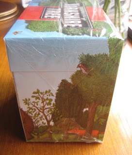
Yorkshire Tea went to town with this one with a truly delightful piece of WTWTA artwork that spanned all the main panels. 

Yorkshire Tea Limited Edition Where The Wild Things Are Gruffalo Packaging

Yorkshire Tea Limited Edition Where The Wild Things Are Gruffalo Packaging - Back

Yorkshire Tea Limited Edition Where The Wild Things Are Gruffalo Packaging - SideYorkshire Tea Limited Edition Where The Wild Things Are Gruffalo Packaging - Side

The custom graphics integrated very well with the core box design and, thus, worked excellently in enhancing the sense of association between the two brands. Moreover, with small creatures of varying kind featured throughout the artwork, I felt my interest was maintained as I looked over the product. Indeed, I was charmed by the back panel in particular where a short poem about the Gruffalo "losing the deep dark wood" served as an entertaining way to relate the brand's campaign to get a million trees planted.

SUMMING UP
This was a great design from the Yorkshire Tea team that integrated seamlessly with their core look and communicated their campaign message in a way that actually put a smile on my face instead of just trying to sound worthy.

MORE INFORMATION

BRAND LINKS  
Yorkshire Tea Website

Friday, 29 May 2015

OLD FAVOURITE: Maryland Chocolate Chip Cookies

With it being National Biscuit Day and having just done a PG Tips review, it would be remiss of me not to mention something of the dunking variety. With Maryland having reminded of the day's significance I thought it only right that I review their now classic of the biscuit tin, the chocolate chip cookie. 

Maryland Original Chocolate Chip Cookies Packaging with Tea

THOUGHTS 
The packet is unapologetically bright and bold with its shiny red wrapping, jolly 'Maryland' font and graphic declaring the product to be the nation's favourite cookie. Indeed, in terms of shelf standout, this packaging manages to draw the eye and lure it in with the promise of something that, even if just momentarily, will brighten the darkest and dullest of days - and we can certainly get a few of those up here in the North :) 

Maryland Original Chocolate Chip Cookies Packaging with Tea

Maryland Original Chocolate Chip Cookies Open Packaging with Tea

Maryland Original Chocolate Chip Cookies with Tea


Opening the packet, the very pleasant scent of cookie dough wafts out. The loose cookies are relatively small in appearance (around 5cm at their widest); however, they're a decent thickness and, for their size, weigh in at a respectable 9-11g each. Studded with chocolate chips, which can be a bit unevenly distributed  in parts (though this makes them feel a bit less machine made to me), the cookies have a nice even bake and are very appetising.

Maryland Original Chocolate Chip Cookie Close Up

Maryland Original Chocolate Chip Cookie Close Up Underside

Taking a bite, the cookies, being of the hard variety, provide a nice crumbly texture and slight sweetness which is delightfully punctuated by the chocolate chips with their darker, cocoa-rich notes. Of course, with dunking the textures are rather sacrificed but it does intensify the core flavours a little and is just the thing if you want that quick hit of sweet cocoa. Also, I should point out that, dunking-wise, Maryland's offering is, literally, a tough little cookie with it lasting a pretty impressive 23 seconds in a freshly made cuppa.

SUMMING UP
A cheery little product with good shelf standout, Maryland Chocolate Chip Cookies have stood the test of time and are now a staple of many a British biscuit tin. Indeed, they may be small and understated when compared to newer offerings, but they're good on price, boast impressive dunking stats and pack in enough deliciousness to keep the nation coming back to them.

BRAND LINKS  
Maryland Cookies Twitter

NOSTALGIA HIT: 70's PG Tips

Look out, it's Bond, Brooke Bond with his tea stirred, not shaken.


LINKS  
PG Tips

Wednesday, 27 May 2015

NEW PACKAGING: PG Tips Original

I thought I would kick things off with one of Britain's most iconic brands that has harked back to deliver us new packaging billed as its “biggest revamp in 19 years”.

New Old Packaging Comparison PG Tips Original Pyramid Tea Bags

THOUGHTS
Shelf standout: My eye was definitely caught by the front panel’s confident, clean look. By eliminating blue – which was always Tetley’s calling card - and returning to the brand’s classic white colour scheme the product immediately stood in strong visual contrast to neighbouring teas. Moreover, the tone felt unique with its move towards a more premium feel in the everyday tea category.  

Personality:
- Primary panels (front and top)


PG Tips Original Pyramid Tea Bags White Packaging Revamp - Front

PG Tips Original Pyramid Tea Bags White Packaging Revamp - Monkey

PG Tips Original Pyramid Tea Bags White Packaging Revamp - Open Lid

This is where the design exuded a significant amount of retro charm for me with its smart text and white, stripped-back look communicating a strong, classic proposition. 


A nod to a design of old...


Retro Brooke Bond PG Tips - White Packaging

Moreover, by virtue of this look, it felt like a relatively mature, sophisticated design that leaned much more heavily towards an upmarket positioning than its predecessor. That said, upon closer inspection, the cheery, fun personality of the brand’s mascot did shine through in the subtle Monkey graphic worked in to the lid’s heritage design element.


Side panels: 
PG Tips Original Pyramid Tea Bags White Packaging Revamp - Side

PG Tips Original Pyramid Tea Bags White Packaging Revamp - Side

Taking the box off the shelf, the sides surprised me little as a more contemporary look was exposed. The panels delivered bold red and green statements together with icon-based graphics and slightly more playful type. Plenty of visual cues linked these panels back to the primary ones but the classic-contemporary split kept them disjointed in feel for me.

Back panel


PG Tips Original Pyramid Tea Bags White Packaging Revamp - Egyptian Monkey

This was where the design let its hair down a bit with some of the fun we have come to associate with the brand. The text wasn’t too exciting but the brand’s much loved Monkey character finally got a showing with a large graphic showing him sporting some nifty Egyptian gear.

SUMMING UP
Cons: Whilst positive on the whole, I thought there was room for improvement in making the design more congruous with the fun and warmth the brand’s advertising communicates. The primary panels were a strong statement for me but I thought the others could have benefited from being relaxed to give us more charm and sense of homeliness. Indeed, it might be argued that the one key property through which most people now identify with the brand, Monkey, should have been given a more salient role in the design.

Pros: Personally I loved the return to all white panels just for the interesting nod to the past they represented. But nostalgia aside, I felt shelf standout was improved, plus the clean look struck me as a confident statement amongst its competitors that spoke a bit more loudly of iconic status and quality. Moreover, the slightly cheeky, fun-loving facets of the modern brand persona were expressed – albeit in a conservative manner. Indeed, in trying to make the product ‘relevant’ to a broad spectrum of consumers, I thought there were elements that, stylistically at least, could play to young and old alike. Furthermore, credit should be given to those involved for being brave and, for better or worse, producing a very interesting design iteration.


MORE INFORMATION

BRAND LINKS  
PG Tips