With a new Star Wars film hitting cinemas this Christmas Kellogg's has got stuck in and released this limited-edition cereal to feed all those budding Jedi's out there. Admittedly, seeing this product on the shelf took me a little aback as it is a rare thing these days to see a film tie-in cereal and it certainly conjured up one or two childhood memories. Anyway, being a fan of Star Wars myself and seeing Kellogg's putting a bit of effort in, I couldn't resist picking up a box for the blog.
THOUGHTS
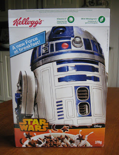
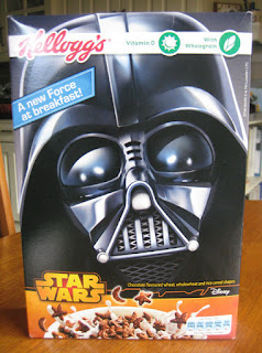
Shelf standout: Scanning the shelves, the cereal box immediately got my attention by virtue of its large, crisp imagery of iconic Star Wars characters. Indeed, the imagery commanded around five-sixths of the box's height and bled right to the edges making for an eye-catching display.
Packaging analysis:- Front panels:
I say panels because either could be the front with both sporting the same graphic of the cereal and Star Wars brand name at the bottom and only differing in character images. Of course, this interesting break in front-back panel convention was the product of Kellogg's bringing a bit of creative concept to the design, that is, the two panels representing the light and dark 'sides' of the Force. Whilst I'm certainly not saying it was the most amazing thing ever, the very fact that a larger concept has been played with here is a definite step up on the creative ladder and, to be honest, heartening to see within the cereal category.
Also, very much worthy of note here is the lovely nod to advertising history with the packaging's strapline "a new Force for breakfast", which was used way back in the 80's to promote Kellogg's C-3PO's. Take a look...
- Secondary panels:
Also, very much worthy of note here is the lovely nod to advertising history with the packaging's strapline "a new Force for breakfast", which was used way back in the 80's to promote Kellogg's C-3PO's. Take a look...
- Secondary panels:
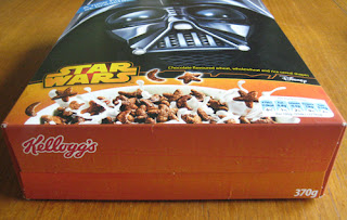
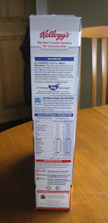
As for the remaining panels there isn't really too much to say here as everything, bar the nutritional panel, has been kept rather plain. To be honest, I feel this is where the packaging let itself down a bit - the panel in which Vader's helmet simply bleeds over on to it felt a bit lazy. Indeed, with more interesting imagery, say a space battle scene, the design could of engaged from multiple angles and provided that extra sense of depth and detail.
Taste:
Trying a handful straight out the box my taste buds were immediately taken back to a product I haven't had for ages, Weetos. The individual pieces proved quite solid when bitten in to with a relatively dense, crunchy texture. Of course, a nice wave of cocoa - sweet but not overly so - hit the palette pretty quickly in a rather tasty and moreish way.
With milk, the cereal proved very sturdy with little sign of sogginess whilst I was eating it. Of course, the cocoa flavour seeped out in to the milk gradually making the cereal progressively more a textural point of interest amongst a nice cocoa-infused pool of brownish milk.
SUMMING UP
I really want to give credit to Kellogg's for injecting a bit of fun and novelty in to the cereal aisle with this tie-in offering. The willingness Kellogg's showed in breaking with convention to deliver a playful concept was great to see and a definite step in the right direction, plus the link to 80's cereal C-3PO's was a lovely nod to advertising history. As for the cereal itself, a clear attempt had been made to make it healthier, it held up in milk very well and it delivered on the taste front. Admittedly, I still think the secondary panels could have benefited from a bit more thought and, of course, I would have loved to have seen some in-box freebies but, all in all, I'm sure children up and down the country will love this.
BRAND LINKS
Kellogg's UK Website
Kellogg's UK Twitter


No comments:
Post a Comment